10 min read
8 Best Framer Templates for Small Businesses
Someone planning a move needs to know whether your team can handle their job and how to get an estimate. Someone choosing a café might be standing around the corner, checking the menu on their phone. If either person has to work hard to find an answer, the homepage has already missed an opportunity.
We picked eight Framer templates for small businesses by looking at the decision each one helps a customer make. The selection ranges from a free consulting website to a $129 photography portfolio. Each pick includes a closer look at the customer journey and one thing worth checking before you buy.
The Best Framer Templates for Small Businesses at a Glance
Template | Best for | What customers can do | Price |
Moving companies and local service providers | Find the right service and enquire about a job | $69 | |
Restaurants and cafés | Check the menu and discover events before visiting | $99 | |
Independent opticians and eyewear retailers | Browse frames, find a store, and enquire about an appointment | $99 | |
Small consultancies launching on a budget | Explore services, meet the team, and get in touch | Free | |
Architecture and interior design studios | Explore individual projects and request a consultation | $79 | |
Independent coaches | Compare individual sessions and an ongoing membership | $29 | |
Owners of a single holiday rental | Explore the property and open its full photo gallery | $49 | |
Independent photographers | Browse the portfolio and contact the photographer about a shoot | $129 |
Template prices are in USD, as listed on GYFT on 12 November 2026.
Our Picks for Small Business Websites
For each recommendation, we considered three questions. What brings a customer to this website? What information do they need before taking the next step? And what will the business owner need to prepare or connect before launch? That last question matters especially if your business depends on bookings, subscriptions, or online payments.
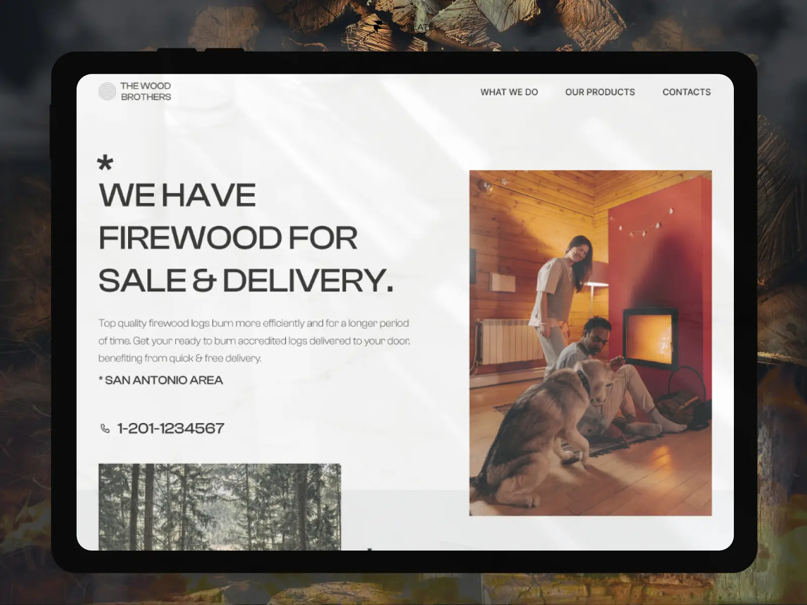
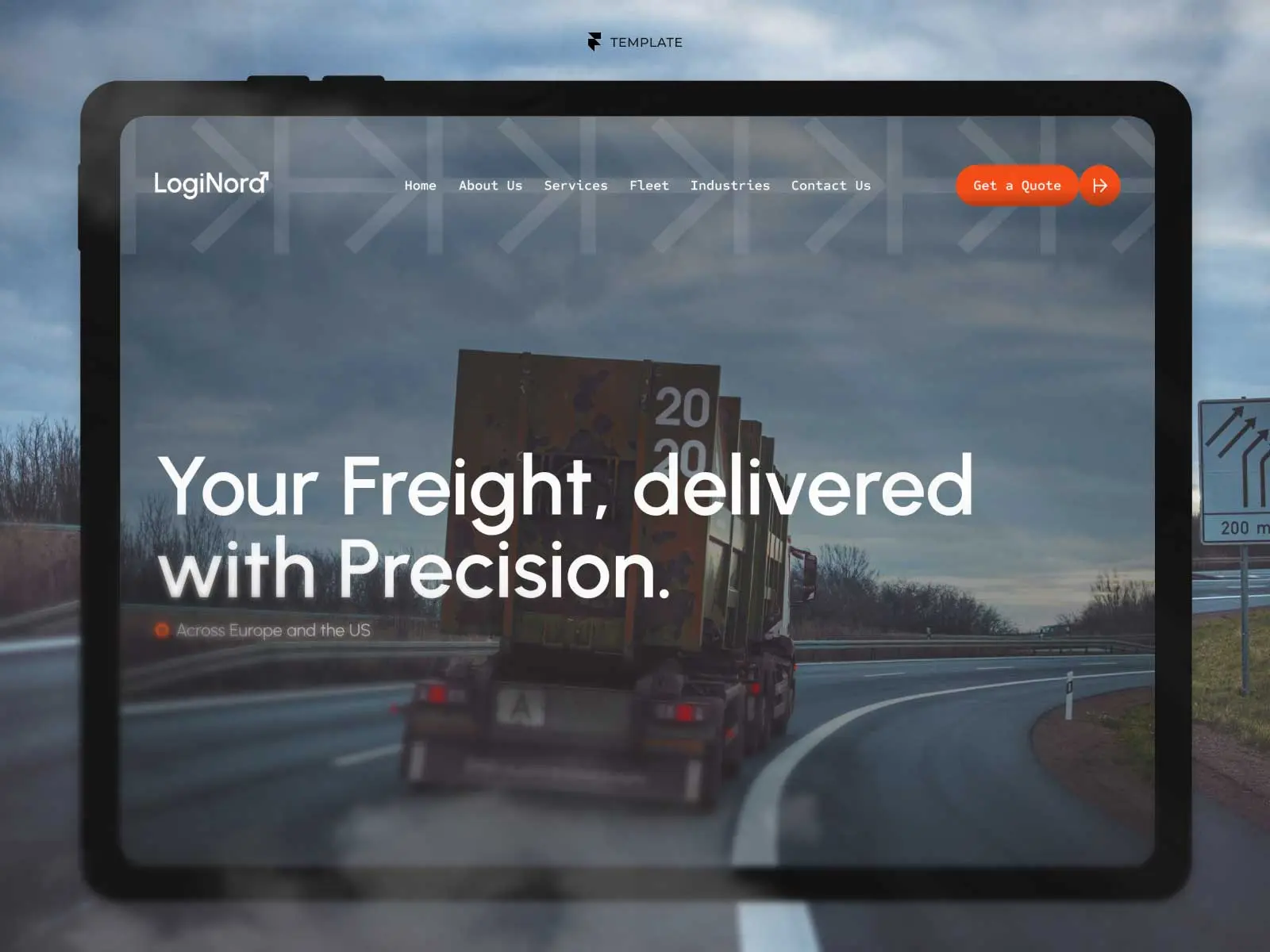
1. NextMove — Best for Moving Companies and Quote-Based Local Services
A customer moving a two-bedroom flat and an office manager relocating a team might land on the same homepage. They have different questions. The first may need help with packing and navigating a narrow staircase. The second may care most about moving outside office hours. NextMove gives a company with several services room to answer those questions individually.
The template includes a services collection in Framer’s CMS, individual service pages, and a contact page. That structure is the reason to choose it. A moving company can give residential and commercial work their own pages. An installation or maintenance business could use the same structure to explain the jobs it takes on, the area it covers, and what a first visit involves.
Before you buy, write down what your team needs to prepare an estimate. For a mover, that might include the collection and delivery areas, preferred date, property size, and access restrictions. Compare that list with the enquiry form you plan to launch. Getting those details in the first message can save both sides an extra phone call.
2. Toasted Buns — Best for Restaurants and Cafés Where the Menu Drives the Visit
Imagine two people outside your café. One wants to know whether there’s something they can eat. The other remembers seeing a weekend workshop on Instagram and wants to check the details. Toasted Buns gives both visitors a reason to open the website, even if they already know where to find you.
Its strongest feature is the CMS-powered menu. For a venue that changes dishes or prices, a menu organised as editable content is a practical starting point. The template also makes room for events and workshops, which makes it particularly relevant to cafés, bakeries, and neighbourhood restaurants with a programme beyond daily service.
Before you buy, open the menu on your phone and try a task one of your customers would actually attempt. How easily could they find a lunch dish, check its price, and decide to visit? If table reservations account for a large share of your business, follow that path separately and establish where your own reservation provider needs to connect.
3. Vista — Best for Opticians Combining Product Discovery With In-Store Care
A shopper might start with a specific frame in mind. A patient might need an eye exam and want to know which branch to contact. An independent optician often serves both people, and a website organised entirely around products or entirely around appointments can make one of those journeys awkward.
Vista gives eyewear, contact lenses, and accessories their own catalogues. Shoppers can narrow down frames using filters such as brand, shape, and material. Dedicated service pages explain eye exams and contact lens fittings, while location information helps visitors plan a trip to a store. That combination makes Vista especially relevant to an optical business with several branches or a carefully selected collection worth browsing before a visit.
Before you buy, decide where you want the transaction to happen. Vista is a good fit for helping customers discover a product and then contact or visit the business. It also includes cart and checkout interface designs. Taking payment online requires an ecommerce integration. If direct sales are central to your plan, include that work in your launch budget.
4. DS Consulting — Best Free Framer Template for a Small Consultancy
When a potential client receives your name through a referral, their first visit can be quite focused. They want to confirm that you handle their kind of problem, understand who they would be working with, and find a way to start a conversation. DS Consulting covers those basics with pages for services, the company, its mission and team, and contact details.
This is the free pick I’d shortlist for a small partnership preparing its first website. The structure gives the founders room to introduce themselves and explain their practice without committing them to a large publishing schedule. Most of the work before launch will be editorial. A service description like “We help family-run manufacturers plan a change of ownership” gives a prospective client something specific to recognise.
Before you choose it, draft one short service description and a biography for each partner. Then look at the demo’s client and partner section. Decide what evidence you can put there legitimately, whether that’s a client name you have permission to use, a relevant qualification, or a short description of completed work. Those details will do much of the work of making the site credible.
5. Studio Arch — Best for Architecture and Interior Design Studios
For an architect, a project page can help answer a question a services page struggles with: Has this studio handled a brief like mine? A prospective client renovating a hillside home may want to understand how the studio worked with the slope, the light, or an existing structure. A beautiful finished photograph earns attention. The story behind it helps the client judge whether to get in touch.
Studio Arch gives individual projects their own pages and brings selected work onto the homepage. The preview also includes services, pricing, and a consultation link. A visitor can start with a project that catches their eye and then investigate the practical side of hiring the studio. That makes it a strong fit for practices whose completed work is their best introduction.
Before you buy, build one project story using material you already own. Choose an opening photograph, write two sentences about the brief, and identify one decision worth explaining. If you can do that for several projects, you have the foundations for a persuasive site. If your strongest work is still under construction, think about whether drawings, plans, or progress photographs can tell the story.
6. CoachOne — Best for Coaches Offering Several Ways to Work Together
A new coaching client may be ready to spend an hour with you while knowing very little about how your practice works. Asking them to choose between an introductory call, a focused session, and a recurring membership is easier when they can compare those options in one place.
CoachOne uses a single-page layout to present the coach, session formats, pricing, and membership. One useful detail in the preview is how the individual sessions are described. The examples have different purposes and durations, including a 90-minute clarity session and a shorter session focused on a particular obstacle. That gives the visitor a concrete basis for choosing. The membership has its own explanation of what clients receive over time.
Before you buy, follow the route for the service you sell most often. In the preview, the main session button takes visitors to pricing. Work out what should happen from there in your business: choosing a time, completing an intake form, or paying for a session. If you offer membership, check that route separately, including how someone receives access after signing up.
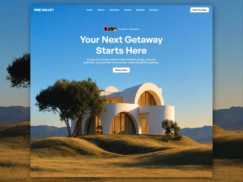
7. Pine Valley — Best for Showcasing a Single Holiday Rental
An owner promoting one cabin has a different job from an agency managing thirty properties. Visitors already know which property they’re considering. What they need is a good sense of the place. Is there somewhere comfortable to spend a rainy afternoon? How private is the terrace? What does the second bedroom actually look like?
Pine Valley is a single-page template built around property imagery, with a gallery that visitors can expand. It also uses a layout that can be edited without configuring a CMS. For an owner managing one property with a relatively stable set of photographs and details, that keeps the amount of content to maintain manageable.
Before you buy, look through your photo library in the order a guest might explore the property. Start with the setting, move through the main living spaces, and include the less glamorous details guests ask about. Then decide where guests will check dates and make a reservation. Pine Valley earns its place here for the property presentation and gallery. Treat availability, rates, and booking as a separate part of your setup.
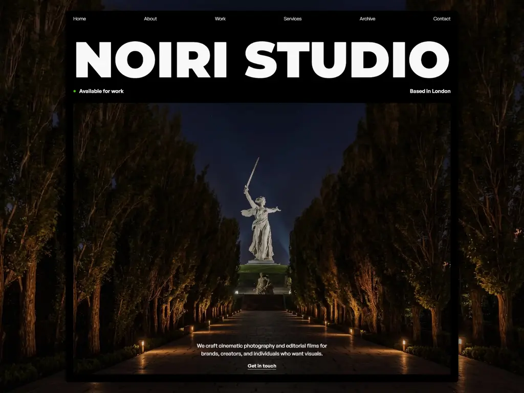
8. Captured — Best for Independent Photographers Selling a Distinctive Style
Someone commissioning photography is choosing both a body of work and a person. An art director may like one portrait but still want to see whether the photographer can sustain that style across a full shoot. A private client may want to know who will be behind the camera and where they are based before making contact.
Captured brings the photographer’s identity and location into the opening experience, with clear routes to the portfolio, biography, and contact page. The preview gives the images substantial space and keeps contact details close at hand. It suits an independent photographer whose work is distinctive enough to carry the first impression and whose next business goal is an enquiry about a commission.
Before you buy, choose a small set of images from the kind of assignments you want to attract. Include a mix of portrait and landscape orientations and consider how those photographs would read on a phone. If you also need private client galleries, proofing, or print sales, identify how you’ll deliver those services alongside the public portfolio.
What to Check Before You Buy a Framer Template
Once you have two candidates, open both previews on your phone. Give yourself the same realistic task on each and see where you hesitate. These four checks will help you decide which one is closer to the website your business needs.
Follow the most important action all the way through. For a café, start at the homepage and find something you would order. For a consultancy, choose a service and find the person or form you would contact. For a coach, follow the booking button beyond its first destination. Note any step you would need to add yourself.
Try one real piece of content. Pick your longest dish name, a service that takes a paragraph to explain, or a project photographed mostly in portrait orientation. Consider how it would fit the layout. A template that accommodates your actual material will be easier to adapt than one that depends on commissioning a new set of assets.
Check what happens after the click. An appointment enquiry, a confirmed booking, and a paid booking are three different outcomes. The same applies to browsing frames and paying for a pair. Identify the result you need and who or what handles it, down to the inbox, calendar, or checkout your team already uses.
Picture an ordinary update a month after launch. Who changes a menu price, adds a project, replaces a seasonal photograph, or updates a branch’s opening hours? Ask that person to look at the template with you. The design decision you make once can affect a task someone repeats every week.
If two templates still feel equally suitable, choose the one that already handles the most important customer journey with the fewest changes. Once you’ve made your choice, use GYFT’s step-by-step guide to customising a Framer template.
Explore More Small Business Website Templates
If your shortlist is missing a particular industry or service, explore GYFT’s collection for more options across professional services, hospitality, retail, and local businesses. Browse small business website templates on GYFT.

Try Systeme.io
Your website is only the beginning.
Take your Framer site further with funnels, email marketing, automation, bookings and more.


AFFILIATE PARTNER