20 min read
How to Customize a Framer Template: A Step-by-Step Guide
Customizing a Framer template is not about redesigning every page from scratch. It is about making the right changes in the right order.
In this guide, you will learn how to turn a pre-built template into a website that feels aligned with your brand—from colors, typography, and content to components, CMS collections, responsive layouts, SEO, and publishing.
Introduction
A well-designed Framer template can save you dozens of hours. Instead of starting with an empty canvas, you already have a working website structure, responsive layouts, reusable components, interactions, and often a configured CMS.
The challenge is adapting those foundations without losing what made the template effective in the first place.
One of the most common mistakes is to change individual elements before understanding how the project is structured. Colors get replaced layer by layer, component instances become inconsistent, new content breaks layouts, and mobile issues are discovered immediately before launch.
A better approach is to work from the system outward. Understand the template, prepare your assets and content, update global styles and reusable components, and only then edit individual pages. Once the content is in place, review the CMS, responsive layouts, links, forms, SEO, and publishing settings.
Framer Agents can assist with some of this work, but they should be treated as optional production tools rather than replacements for manual editing. They can help with repetitive or clearly defined tasks, but their results still need review and their prompts consume AI credits. For precise visual changes or simple updates, editing directly on the canvas is often faster, cheaper, and more predictable.
What Can You Customize in a Framer Template?
Once a Framer template has been copied to your workspace, it becomes an editable Framer project. You can modify almost every part of it, including:
Colors, typography, spacing, and visual styles
Logos, images, illustrations, icons, and videos
Headlines, body copy, buttons, and calls to action
Pages, sections, navigation, and footer content
Reusable components and variants
CMS collections and dynamic pages
Desktop, tablet, and mobile layouts
Animations and interactions
Forms, integrations, analytics, and SEO settings
This flexibility does not mean you need to change everything. The closer the original structure is to your business needs, the faster and more reliable the customization will be. If you need to rebuild most pages and restructure the entire CMS, the template may not have been the right starting point.
The goal is to preserve what already works while changing what makes the website specific to your brand, audience, and objectives.
Good to Know: Check the creator’s licensing information before using included photography, illustrations, fonts, or other third-party assets. The template may be licensed for commercial use while certain demo assets require separate permission or replacement.
Before You Start: Prepare Your Brand and Content
Preparing the essential material before opening the editor prevents temporary decisions from becoming unnecessary rework.
Brand Identity
Gather your primary and secondary colors, background and text colors, heading and body typefaces, logo variations, and any recognizable icons or brand elements. Keep exact color values and font names in a simple reference document so global updates are faster.
Website Content
Your copy does not need to be final, but you should know what each page needs to communicate. Prepare or outline:
The primary headline and value proposition
Product or service descriptions
Calls to action
Testimonials and customer logos
Team or company information
Frequently asked questions
Contact details
Legal and policy content
Knowing the approximate amount of content also helps identify layouts that may require adjustment.
Images and Visual Assets
Collect product screenshots, team photography, project images, illustrations, background graphics, the social sharing image, and favicon. Use high-quality assets, but resize and compress unnecessarily large files before uploading them.
Pages and Functionality
Compare the template’s page list with what the website actually needs. Decide which pages and sections to keep, remove, or duplicate; whether the CMS structure fits your content; and which forms, integrations, or external tools need to be connected.
Pro Tip: Create a simple page-by-page content map before touching the design. Knowing what belongs on each page is more valuable than immediately experimenting with colors and layouts.
Copy the Template to Your Workspace
For a free template, select Use for Free and copy the project to your Framer account. For a premium template, complete the purchase through the creator’s checkout and open the remix link you receive, usually by email.
After copying the project:
Give it a recognizable name.
Confirm that it is in the correct workspace.
Open and preview every page.
Keep the original remix link or purchase email safe.
Your project is independent from the creator’s original version. You can edit it like any other Framer project, but future updates from the creator will not automatically appear in your copy.
Before significant changes, duplicate the project or create a branch if that option is available in your workspace. This is especially useful when restructuring pages, modifying shared components, or experimenting with a Framer Agent.
Good to Know: Purchasing a template and subscribing to a Framer site plan are separate steps. You will still need an appropriate plan when you are ready to connect a custom domain and publish the website.
Understand How the Template Is Structured
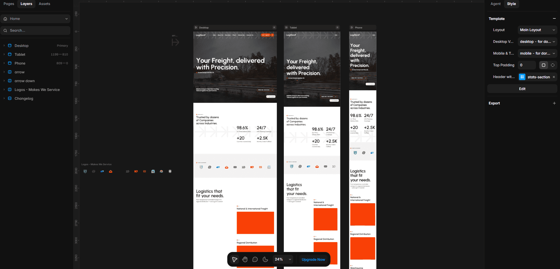
Professional templates usually connect pages through shared styles, components, layout templates, CMS collections, and responsive rules. Spend a few minutes identifying these systems before editing.
Pages and Components
Review static pages, CMS-generated pages, utility pages such as Privacy and 404, and any optional layouts. A page that is absent from the main navigation may still be connected to the footer, CMS, or calls to action.
Next, identify reusable components such as the navigation, footer, buttons, cards, forms, logos, and calls to action. Editing the primary component can update every connected instance, while editing an instance may affect only that occurrence. Decide whether each change should be global or local before applying it.
Styles and Variables
Check how the template controls brand colors, backgrounds, typography, borders, spacing, and light or dark themes. Shared styles and variables allow one change to update many elements, so avoid applying values directly to individual layers until you understand what controls them.
CMS, Breakpoints, and Interactions
Open every CMS collection and see how its fields connect to cards and dynamic pages. Preview the website at desktop, tablet, and mobile sizes, noting any different layouts, component variants, or visibility rules.
Finally, test forms, filters, overlays, carousels, scroll interactions, third-party embeds, analytics events, and custom code. Confirming that they work before customization makes later problems easier to diagnose.
Pro Tip: Preview the original template and take screenshots of its main pages before editing. They provide a useful reference if spacing, responsive behavior, or component states change unexpectedly.
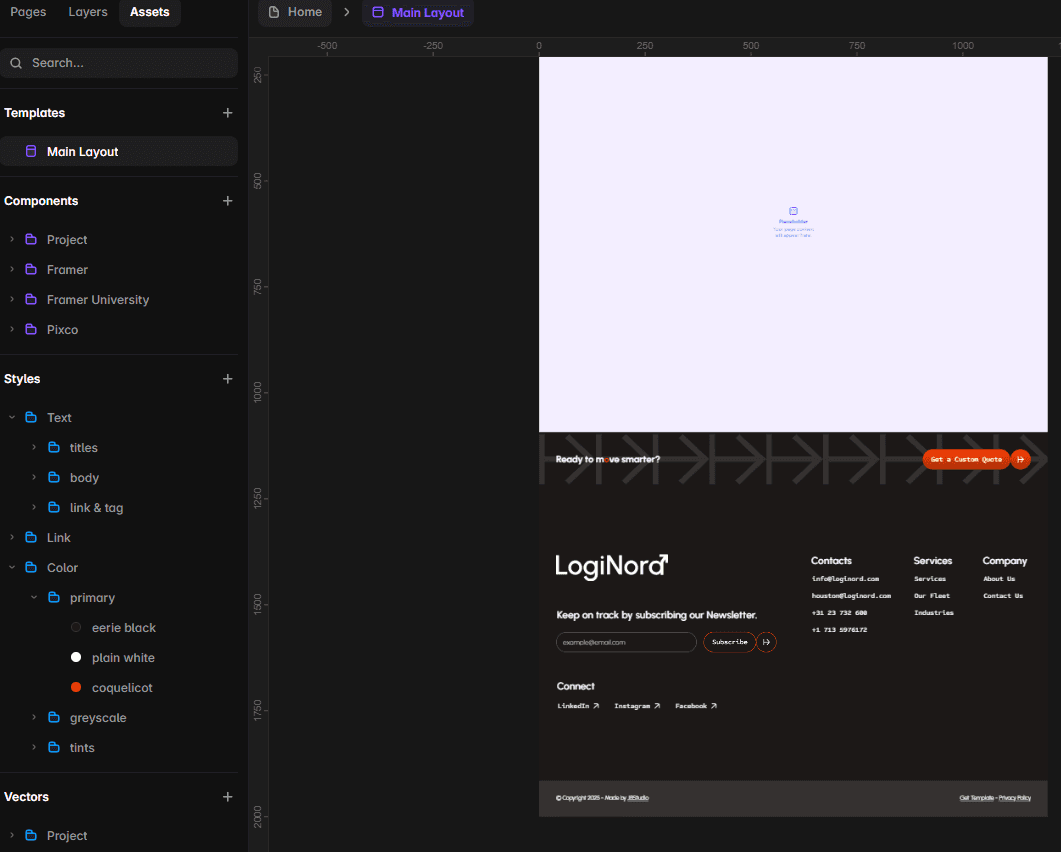
Customize Global Colors and Typography
Colors and typography have the greatest immediate impact on how the template feels. Update them globally before editing individual pages so the new visual system remains consistent.
Update the Color System
Locate the template’s color variables or shared styles. These may include Primary, Accent, Background, Surface, Text, Border, Success, and Error values.
Map your palette to the existing system rather than replacing colors randomly. If one accent controls buttons, links, and highlighted text, updating that shared value preserves the template’s original logic.
Afterwards, review text contrast, buttons, hover states, borders, form fields, icons, light and dark sections, mobile navigation, and overlays.
Accessibility Check: Normal text should generally reach a contrast ratio of at least 4.5:1 against its background. Large text should reach at least 3:1. Do not rely on visual judgment alone.
Update the Typography System
Locate the shared styles for display text, headings, body copy, labels, buttons, links, and CMS rich text. Replace typefaces at the style level whenever possible so the change propagates while preserving the hierarchy.
Confirm that the required font weights and characters are available and licensed for web use. Then review headings, navigation, buttons, cards, forms, CMS articles, and smaller breakpoints.
A wider typeface can introduce new line breaks, increase section heights, or make navigation overflow. Before reducing font sizes, check whether the copy can be improved or the text container adjusted.
Use local overrides only for genuine exceptions. Repeated decisions belong in shared styles, variables, or components.
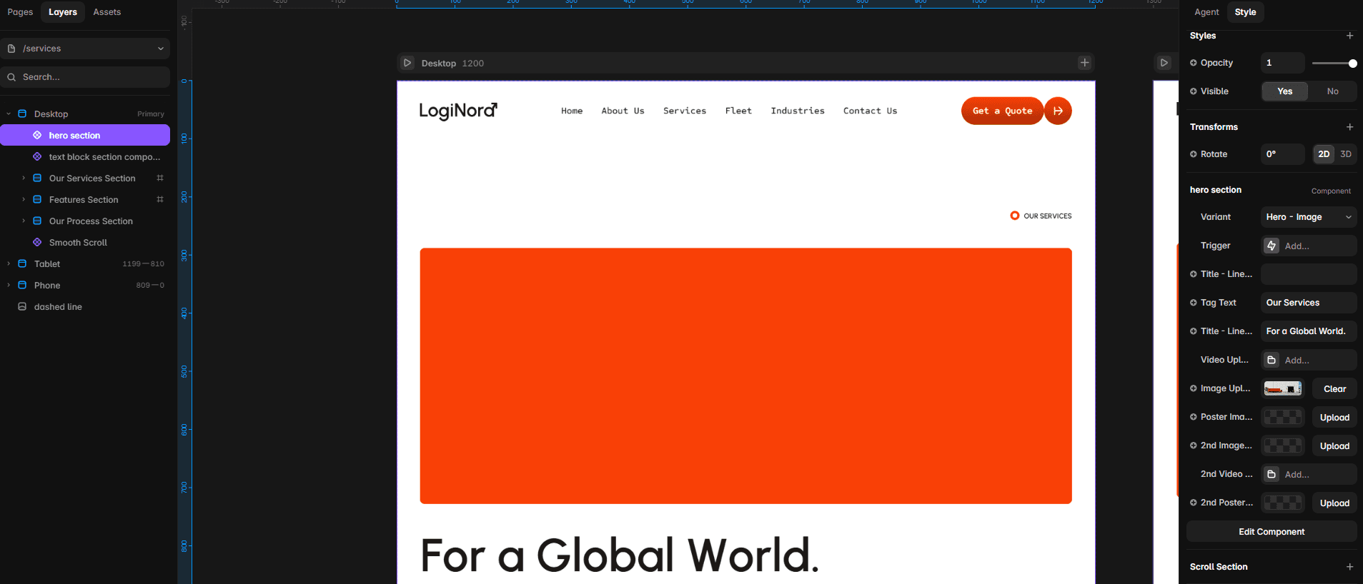
Replace the Logo, Images, and Visual Assets
Start by identifying every place where the logo appears. It is often part of shared navigation, footer, and mobile-menu components. Prepare suitable light, dark, horizontal, or compact versions and use SVG when possible. Preserve the original proportions and adapt the container if your logo has a different shape from the placeholder.
When replacing photography or product images, consider the purpose, aspect ratio, crop, overlapping content, and behavior at each breakpoint. A landscape image that works on desktop may lose its subject on mobile, so adjust its focal point and preview it at several widths.
Before uploading assets:
Resize and compress large images
Prefer modern formats such as WebP when suitable
Use SVG for logos and simple vector graphics
Avoid full-resolution files for small cards
Remove unused assets when practical
Review the license and performance of illustrations, icon sets, Lottie animations, videos, embeds, and three-dimensional assets. Keep icon styles consistent and test autoplay media on mobile.
Meaningful images should have concise alternative text that reflects their role on the page. Decorative graphics that add no information can usually be left without alternative text so screen readers ignore them.
Common Mistake: Replacing an image without checking its crop and positioning on tablet and mobile.
Update the Copy and Calls to Action
Replacing demo copy is not simply exchanging one company name for another. The content should explain who the website is for, what the business offers, why visitors should trust it, and what they should do next.
Start with the homepage value proposition, then work through product or service pages, About, case studies, Contact, footer, legal pages, and CMS content. Search the project for original brand names, placeholder contact details, demo links, testimonials, pricing, and copyright information.
Your copy does not need to match the original character count, but longer or shorter content will affect the layout. If it does not fit:
Improve the copy before reducing the font size
Check whether the text container can be wider
Let cards and sections grow naturally
Use stacks and flexible heights
Review every breakpoint
Every important page should also have a clear next step. Prefer descriptive labels such as Book a consultation, Request a quote, or View our work to generic wording such as Click Here. Use the same label consistently when buttons lead to the same action, and verify every destination.
Finally, keep the tone consistent across navigation, forms, calls to action, error messages, and supporting copy.
Pro Tip: Read every page aloud. Awkward sentences, repetition, and inconsistent terminology are often easier to notice when spoken.
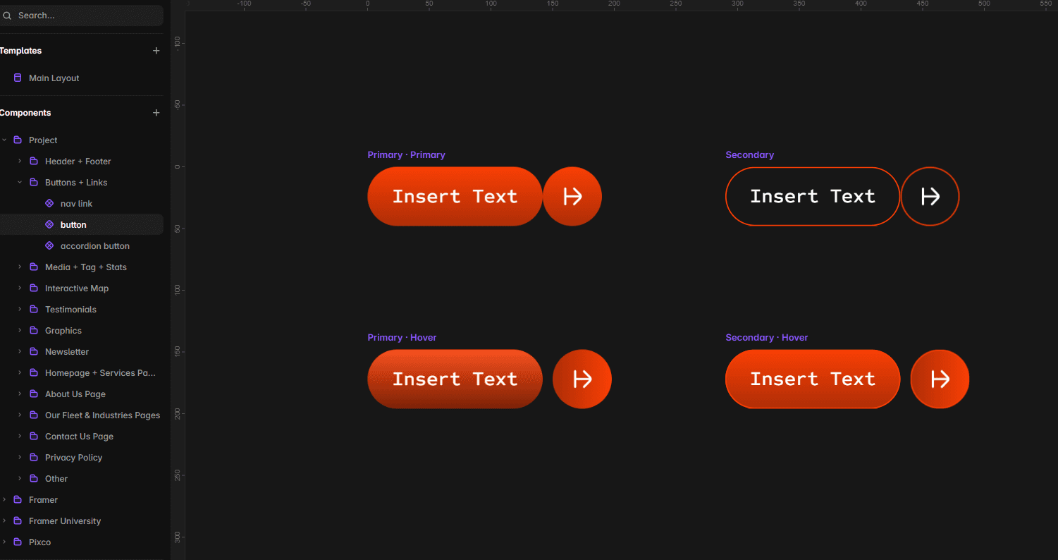
Edit Reusable Components and Shared Layouts
Before changing a component, decide whether the update should apply globally or only to one instance.
Edit the primary component for repeated elements such as navigation, footer, buttons, logos, cards, calls to action, and form controls. Use instance properties when one occurrence needs different text, images, links, icons, themes, or visibility while remaining connected to the shared design.
Review every relevant variant and state, including desktop and mobile navigation, light and dark themes, hover states, open and closed menus, and alternative card layouts. Replacing a logo in the desktop navigation but forgetting the mobile menu leaves the customization incomplete.
Avoid detaching components unless an element genuinely requires an independent structure. First check whether an existing property, a new variant, or an improvement to the primary component can provide the change. Detached instances no longer receive future updates.
If a component is linked from an external project and cannot be edited, review where it is used before unlinking one instance or replacing all instances with a local version.
Some projects also use layout templates for shared navigation, footers, sidebars, or legal-page structures. After editing one, preview several connected pages rather than checking only the page currently open.
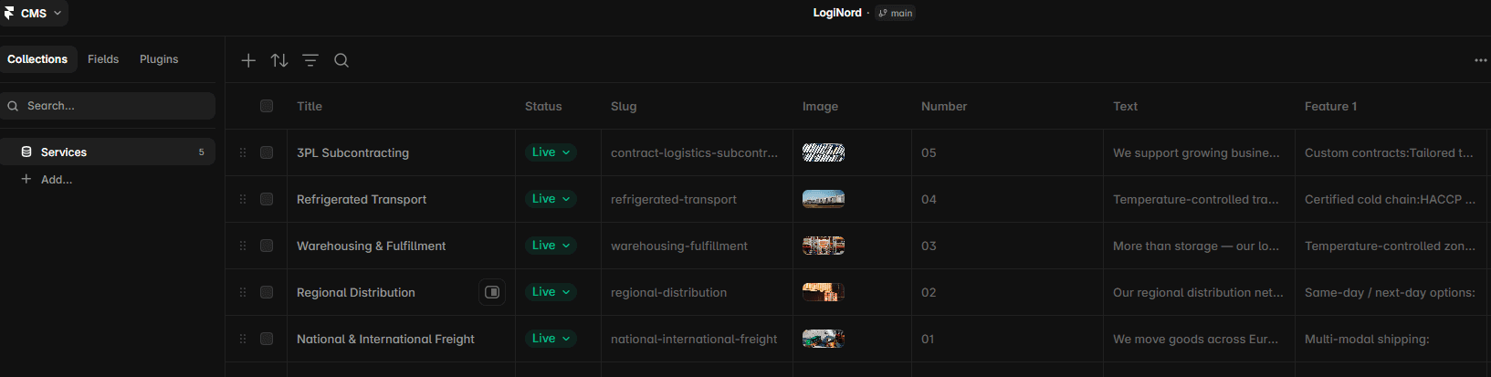
Customize CMS Collections and Dynamic Pages
Templates often use the CMS for articles, projects, services, team members, testimonials, careers, categories, and tags. Open several items from each collection and compare their fields with the corresponding cards and detail pages.
For each collection:
Review the existing fields and relationships.
Decide whether they fit your content.
Add or import your own items.
Check the generated detail pages.
Remove demo content you no longer need.
Review lists, filters, sorting, and related content.
Define concise and readable slugs before launch. If a published and indexed URL changes, create a redirect where appropriate.
Add, rename, or delete fields carefully. A field may control visible content, conditional visibility, filters, sorting, references, component properties, or SEO information even when it appears empty in the CMS.
References and multi-references connect collections and can power categories, related articles, projects by service, team departments, and dynamic filters. Avoid replacing them with manually typed text unless those relationships are no longer needed.
When editing formatted text, use a logical heading hierarchy, check links and images, and preview lists, blockquotes, tables, and spacing on mobile. Content pasted from external documents may bring inconsistent formatting.
Finally, test both detail pages and collection lists with the shortest, longest, and most visually unusual items. Confirm that cards, image crops, filters, sorting, optional fields, and related content behave correctly.
Add, Remove, or Rearrange Pages and Sections
Remove pages and sections that do not support the website’s purpose, such as unused pricing, empty team or careers pages, demo landing pages, and placeholder case studies. Before deleting anything, check navigation, footer, buttons, CMS items, related content, forms, redirects, and search results for incoming links.
Rearrange sections around the visitor’s questions:
What is this?
Is it relevant to me?
Why should I trust it?
How does it work?
What does it cost?
What should I do next?
When adding content, reuse existing section containers, grids, cards, buttons, text styles, spacing variables, and calls to action. Duplicating a suitable page is often more efficient than starting with an empty canvas, but remember to replace its links, metadata, and CMS connections.
Keep new layouts flexible. Use stacks, gaps, padding, and content-based sizing rather than fixed heights where content may change. Then test long and short content, different browser widths, interactions, and background transitions.
Use Framer Agents Carefully
Framer Agents can create or edit content, layouts, components, CMS structures, interactions, and code through written prompts. That does not make them the best tool for every change.
A simple manual edit may be faster than explaining the task, waiting for the result, reviewing what changed, and correcting an inaccurate interpretation. Use an Agent when the task is repetitive, clearly bounded, and easy to verify—not as a substitute for understanding the project.
When an Agent May Help
Agents can be useful for creating a rough first version of a section, applying a clearly defined change across several elements, reorganizing repetitive content, creating a simple component from precise requirements, or exploring an alternative layout on a branch.
Specific instructions produce better results. “Create a three-card testimonial section using the existing text styles, colors, spacing, and button component” is more useful than “make this page better.”
When Manual Editing Is Better
Work directly on the canvas when replacing a single image or paragraph, adjusting a spacing value, changing a shared style, refining typography, fixing responsive behavior, editing a complex component, modifying CMS relationships, or making a visually precise change.
If the Agent has already misunderstood the task more than once, continuing to prompt may be slower and more expensive than completing the edit manually.
Understand AI Credit Costs
Agent requests consume AI credits based on the complexity of the request and the work performed. Larger tasks and repeated corrections can therefore use significantly more credits than expected.
Credits are shared across the workspace and reset monthly. Unused monthly credits do not roll over. When the allowance is exhausted, credit-using features pause until credits reset or more are purchased.
An unsuccessful result still consumes credits. Before prompting, ask whether the manual edit would take less time and how costly several failed iterations might become.
Reduce Risk and Review the Result
Work on one clearly selected section or element at a time. Explain what should change, what must remain unchanged, which existing styles or components to reuse, and how the result should behave at each breakpoint.
For structural changes, use a branch so you can compare, test, and review the result without changing the main project.
Always check content, links, component structure, styles, breakpoints, interactions, CMS connections, accessibility, and unrelated areas of the page. If the output requires several rounds of correction, stop and reconsider the workflow.
Practical Rule: Use an Agent when it removes repetitive work and the result is easy to verify. Edit manually when the task requires precision, judgment, or only a few direct changes.
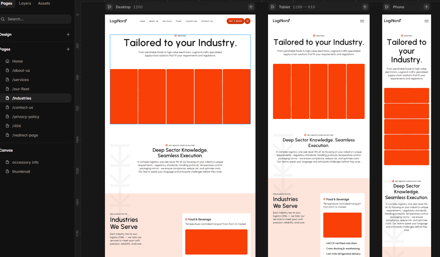
Check Desktop, Tablet, and Mobile Breakpoints
Replacing copy, fonts, images, sections, and CMS content creates new layout combinations, so responsive testing should happen throughout customization.
Start with the primary desktop breakpoint and review content widths, section padding, grids, image proportions, headings, cards, and navigation. Fix structural issues there before applying breakpoint-specific adjustments.
Treat tablet as a real layout rather than a transition between desktop and mobile. It often reveals navigation that no longer fits, compressed grids, awkward headlines, excessive padding, or overlapping elements.
On mobile, check navigation, heading sizes, buttons, tap targets, image crops, forms, horizontal scrolling, sticky elements, overlays, carousels, and the footer. Hide non-essential decorative elements if they dominate the content or affect performance.
Do not test only the exact breakpoint sizes. Resize the preview gradually and look for sudden spacing changes, overflow, compressed grids, or navigation that breaks before its mobile variant appears.
Use real content, including the longest navigation label, headline, card title, testimonial, and button text. Also test interactions, form feedback, touch behavior, and reduced-motion preferences.
Finally, open the published preview on real devices and more than one browser. Mobile browser bars, viewport height, keyboards, fixed elements, and autoplay media may behave differently from the editor preview.
Common Mistake: Treating mobile as a final visual check. Review responsive layouts whenever content, typography, images, components, or CMS items change.
Configure Links, Forms, SEO, and Analytics
Once the design is complete, review the systems that turn it into a functional business website.
Links and Forms
Check navigation, footer, buttons, text links, social icons, logos, CMS cards, email addresses, telephone numbers, legal pages, and external resources. Remove links to the template demo, creator website, placeholder profiles, or example booking pages. Internal links should normally open in the same tab; external links may open in a new one when that helps the visitor.
For every form, verify labels, required fields, input types, submission destination, notification email, success and error states, privacy messaging, and external integrations. Submit each form from a published preview and confirm that the data reaches the correct destination.
SEO and Content Structure
Add a unique SEO title, meta description, readable slug, and social sharing information to every important page. Configure CMS pages with dynamic fields rather than using the same generic metadata for every item.
Each page should also have one clear primary heading, logical secondary headings, descriptive links, meaningful image alternative text, relevant internal links, and clear content. Use shared text styles for visual presentation without weakening the semantic hierarchy.
Create redirects when replacing an existing website, changing published URLs, renaming indexed CMS slugs, consolidating pages, or removing content that already receives links or traffic.
Analytics and Privacy
Remove any tracking configuration that belongs to the template creator and connect the analytics platform you intend to use. Track actions that answer meaningful questions, such as primary CTA clicks, form submissions, purchases, newsletter sign-ups, and important outbound links. Verify that visits and events are recorded correctly.
Analytics, forms, embedded media, and marketing tools may also create privacy obligations. Review whether the website requires a privacy policy, cookie notice, preference controls, consent messaging, or information about third-party services. Do not assume that the template’s demo legal text is suitable for your business.
Pro Tip: Complete one full visitor journey before launch—from arriving on the homepage to submitting the main form or completing the primary action.
Framer Template Pre-Launch Checklist
Complete one systematic review before publishing.
Content and Navigation
Replace all demo copy, images, names, contact details, testimonials, and prices
Proofread the content and review legal information
Check desktop and mobile navigation, footer links, buttons, cards, and the logo link
Remove unused pages and CMS items
Test email, telephone, social, and external links
Review the 404 page and redirects
Forms, CMS, and Functionality
Submit every form and test success and error states
Verify recipients, newsletter connections, and external integrations
Test filters, search, accordions, tabs, overlays, carousels, and embeds
Review every CMS collection, its slugs, references, sorting, and formatted text
Test long, short, missing, and optional CMS content
Confirm related content and dynamic links
Responsive Design and Accessibility
Review desktop, tablet, mobile, and widths between breakpoints
Check image crops, long headings, navigation, sticky elements, and horizontal overflow
Test on real devices and multiple browsers
Use a logical heading hierarchy and meaningful alternative text
Check color contrast, keyboard navigation, focus states, labels, tap targets, and reduced motion
SEO, Performance, and Analytics
Add unique titles, descriptions, slugs, and social images
Configure CMS metadata, indexing, canonicals, internal links, and redirects
Confirm that the sitemap contains the correct pages
Compress large images and review videos, embeds, fonts, and excessive animations
Remove demo tracking and test analytics events
Review cookie, privacy, and consent settings
Publishing
Connect the custom domain and check DNS settings
Add the favicon and review the default language
Test the staging or preview version
Publish and test the live domain
Submit the sitemap to relevant search engines
Monitor forms and analytics after launch
A website does not need to be perfect before it goes live, but it should be complete, functional, and trustworthy. The purpose of this review is to prevent avoidable issues from becoming a visitor’s first impression.
Final Check: Ask someone unfamiliar with the project to complete its primary action. A fresh perspective often reveals unclear navigation, missing information, or broken links.
Final Thoughts
A Framer template is a professional starting point, not a finished website.
The best customizations preserve the systems that already work while adapting the identity, content, and structure to a specific business. Understand the project before editing, update global systems before individual layers, reuse components, review the CMS carefully, and test every breakpoint.
Framer Agents can help with repetitive or exploratory work, but they are optional. Manual editing remains more reliable when a change requires precision, judgment, or only a few direct adjustments.
Most importantly, do not make the template different simply for the sake of being different. Make it feel specific to your brand while preserving the clarity, usability, responsiveness, and design quality that made it worth choosing.
Frequently Asked Questions
Are Framer templates fully customizable?
Yes. Once a template has been copied to your workspace, you can edit its content, colors, typography, layouts, components, CMS collections, interactions, and page settings like any other Framer project. Some third-party assets, fonts, or integrations may have separate licensing or account requirements, so review the information provided by the template creator.
How do I edit a Framer template after purchasing it?
Can I use a Framer Agent to customize the entire template?
Can I customize a free Framer template?
Will updates from the template creator appear in my project?
Can I change the CMS structure included with a template?
How long does it take to customize a Framer template?

Try Systeme.io
Your website is only the beginning.
Take your Framer site further with funnels, email marketing, automation, bookings and more.


AFFILIATE PARTNER