8 min read
How to quickly build your first website in Framer
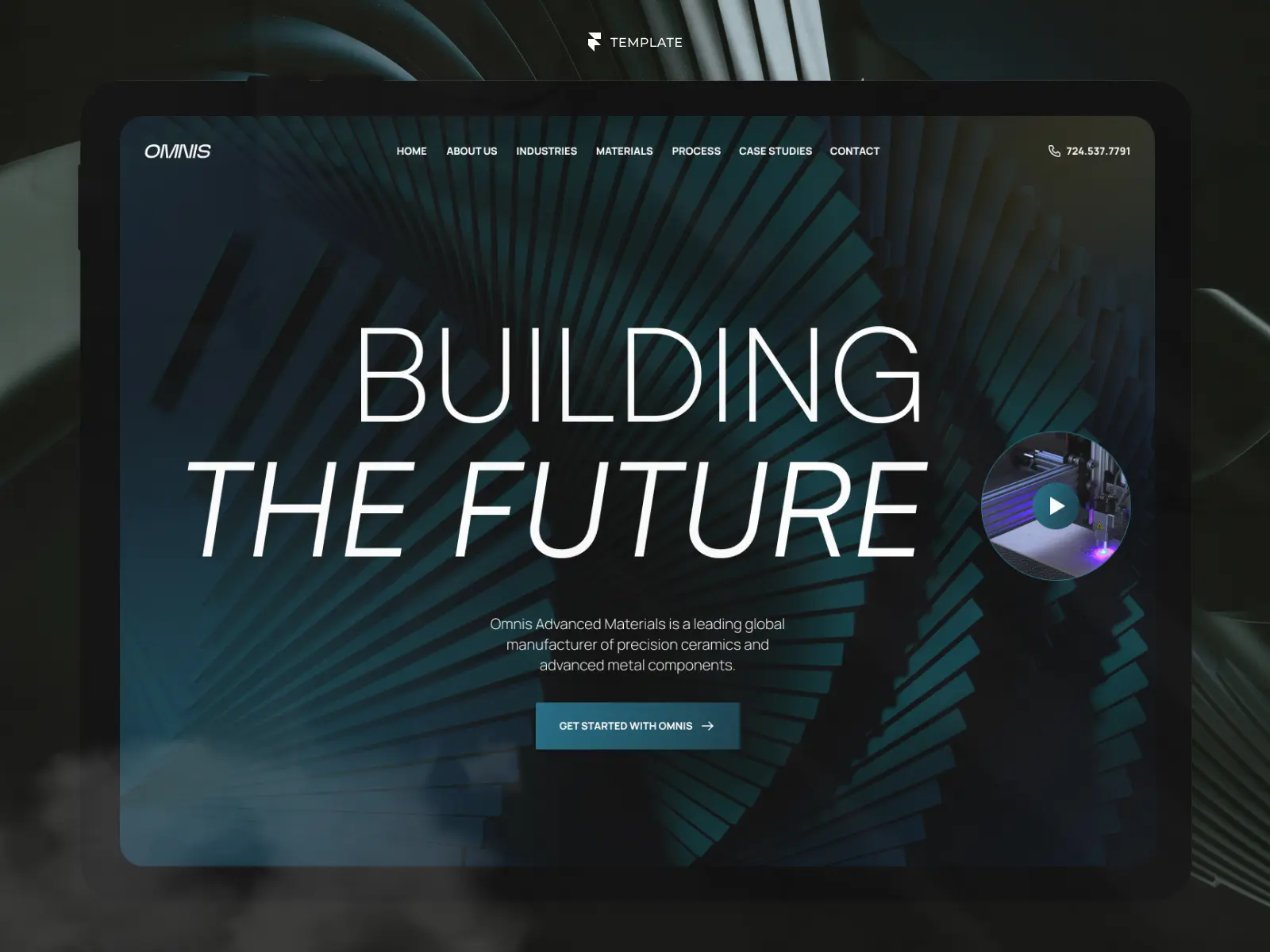
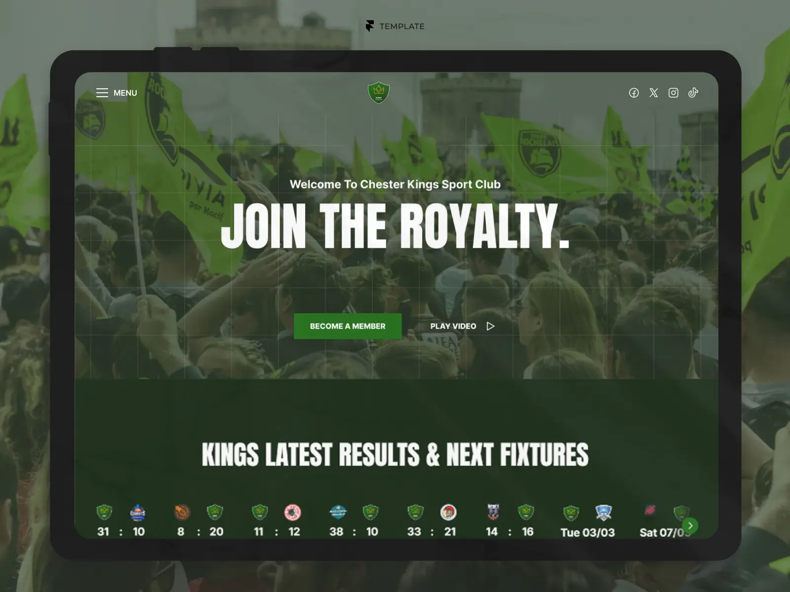
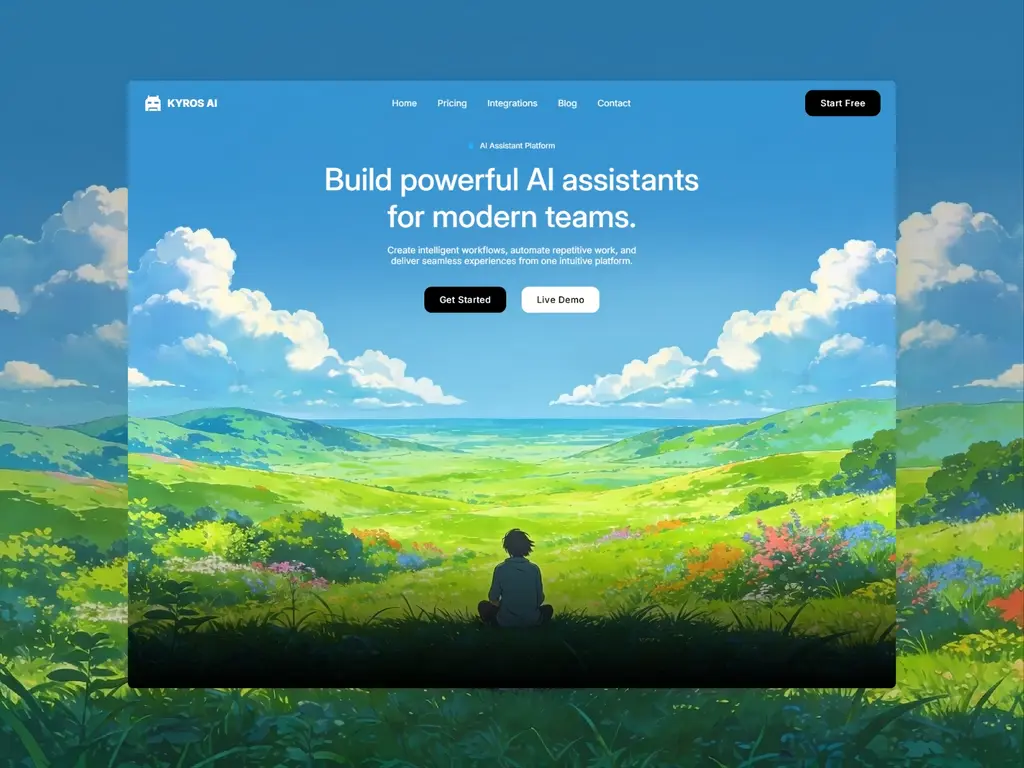
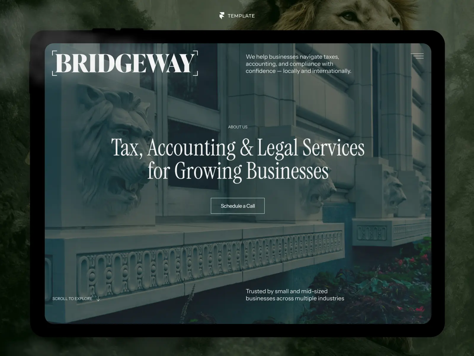
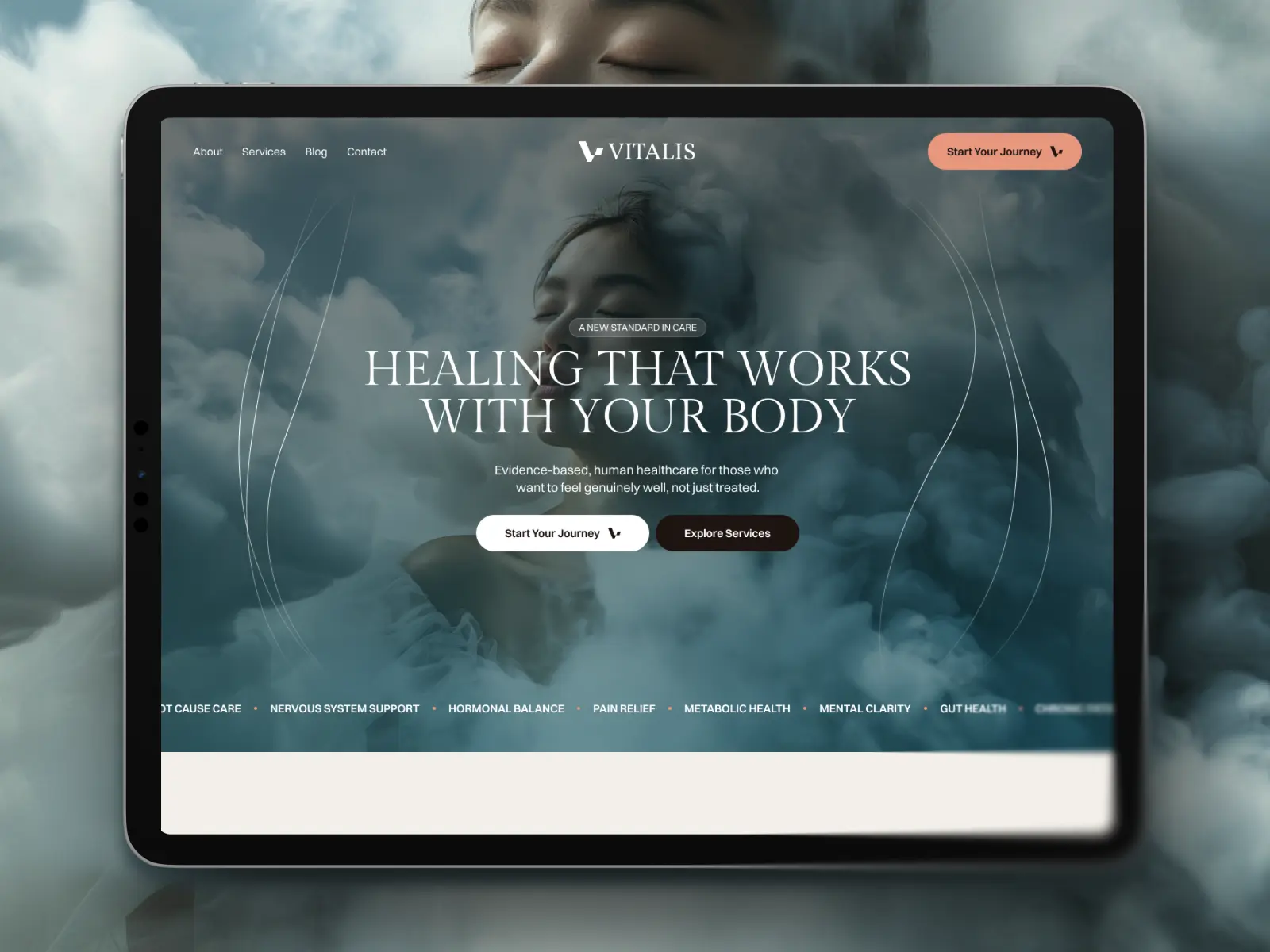
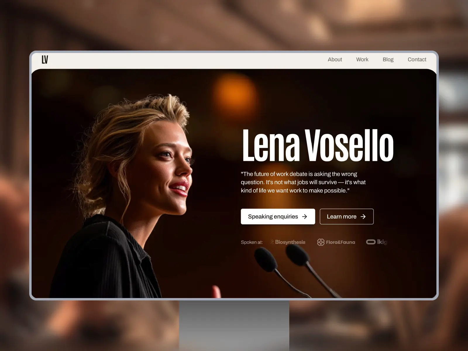
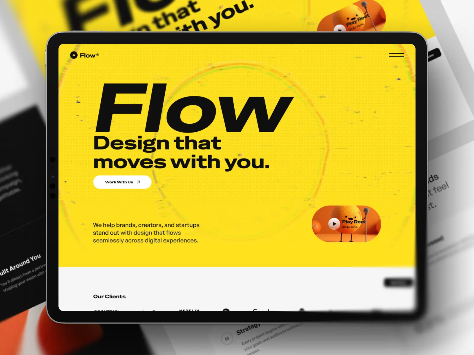
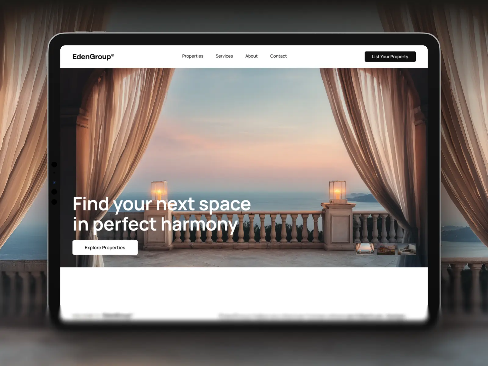
Framer makes it possible to design, build, and publish a professional website without writing code. If you're building your first website, the fastest approach is to start with a well-designed template, customize it to match your brand, optimize it for every device, and publish once everything has been properly tested.
Introduction
Building your first website can feel overwhelming. Choosing the right platform, designing every page, making sure everything works on mobile devices, and preparing your site for launch are just a few of the decisions you'll need to make.
Fortunately, modern website builders have made this process much more accessible. Framer has quickly become one of the most popular platforms for designers, freelancers, startups, and businesses looking to create fast, responsive websites without writing code.
Unlike traditional website builders, Framer combines visual design, CMS, animations, and publishing into a single platform, allowing you to go from idea to live website much faster.
In this guide, you'll learn the essential steps to building your first website in Framer, along with practical advice that will help you avoid common beginner mistakes.
Why Choose Framer?
There are many website builders available today, but Framer has become particularly popular because it offers an excellent balance between design flexibility and ease of use.
Some of its biggest advantages include:
A fully visual, no-code editing experience
Responsive layouts built for desktop, tablet, and mobile
Powerful CMS for blogs, case studies, and dynamic content
Excellent performance out of the box
Fast publishing with built-in hosting
Modern animations and interactions without writing JavaScript
Perhaps the biggest advantage is that Framer allows you to focus on building your website instead of managing plugins, themes, or complicated technical setups.
Start with the Right Template
One of the biggest mistakes beginners make is trying to design everything from scratch.
While creating your own design can be a great learning experience, it also requires a significant investment of time and experience. A professionally designed template gives you a solid foundation, allowing you to focus on your content instead of rebuilding common layouts.
When choosing a template, don't focus only on how it looks.
Instead, consider questions like:
Does it include all the pages I need?
Is it designed for my type of business?
Does the content structure match my goals?
Is it responsive across all devices?
Can it grow as my business grows?
A well-structured template can easily save dozens of hours during your first website project.
Pro Tip: Choose a template based on its structure rather than its colors. Branding is easy to customize. Rebuilding an entire page structure isn't.
Customize Your Content
Once you've chosen a template, it's time to make it your own.
Start by replacing every placeholder with your own content.
Focus on:
Copy
Write clear headlines that explain what you do and why visitors should choose you.
Images
Use high-quality images that support your message and reflect your brand.
Typography
Keep your typography simple and consistent. Two font families are usually more than enough for an entire website.
Brand Colors
Replace the template's colors with your own brand palette while maintaining sufficient contrast for readability.
Remember that good content will always have a bigger impact than impressive animations.
Design for Every Screen Size
More than half of all website traffic now comes from mobile devices. For that reason, responsive design shouldn't be treated as a final step—it should be part of your workflow from the beginning. As you build your website, regularly check how each page looks on:
Desktop
Tablet
Mobile
Pay close attention to:
Text readability
Button sizes
Navigation
Image cropping
Section spacing
Small adjustments made early are much easier than fixing an entire website before launch.
Common Mistake: Many beginners perfect the desktop version first and only check mobile at the end. Responsive design works best when it's part of the process from day one.
Prepare Your Website for Launch
Before publishing, spend a few minutes reviewing the essentials.
A simple pre-launch checklist can prevent many common issues.
Make sure you've:
Added an SEO title and meta description for every page
Uploaded a favicon
Configured your Open Graph image for social sharing
Connected your custom domain (if applicable)
Tested every form
Checked all links
Reviewed your website on multiple devices
Proofread your content for spelling and grammar
Taking the time to review these details helps create a more professional first impression.
Publish with Confidence
Publishing your first website is an exciting milestone, but it's important to remember that launching isn't the finish line.
The best websites continue to evolve over time.
Monitor how visitors interact with your pages, improve your content, refine your messaging, and make small updates regularly. Continuous improvements often have a much greater impact than waiting for a complete redesign.
Your first website doesn't need to be perfect—it simply needs to solve a problem for your audience and provide a great user experience.
Key Takeaways
Start with a well-designed template instead of building everything from scratch.
Prioritize content and usability before animations or visual effects.
Design for desktop, tablet, and mobile throughout the entire process.
Complete a pre-launch checklist before publishing your website.
Continue improving your website after launch based on real user feedback.

Try Systeme.io
Your website is only the beginning.
Take your Framer site further with funnels, email marketing, automation, bookings and more.


AFFILIATE PARTNER