8 min read
Homepage Design Inspiration: 20 Hero Sections
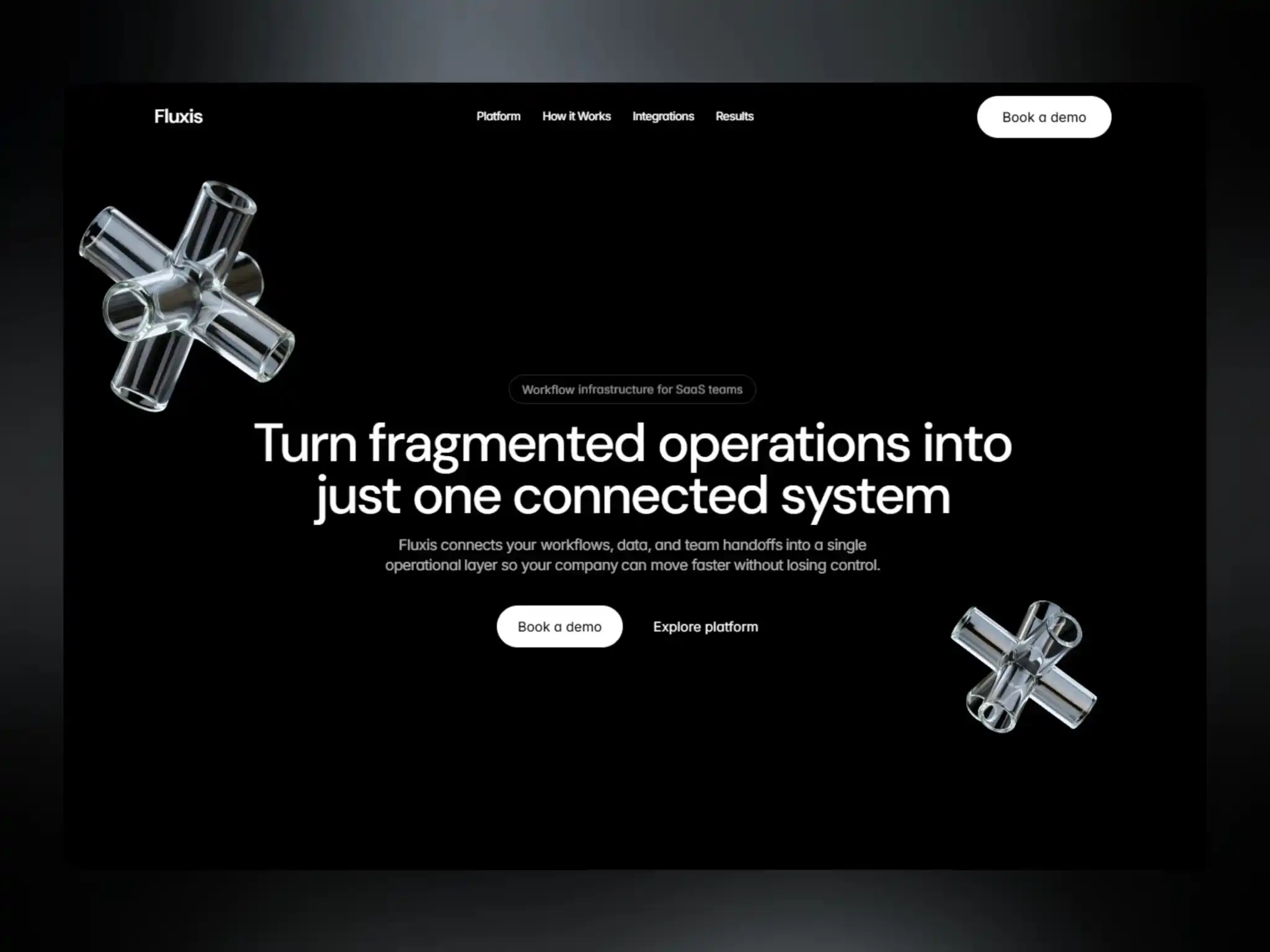
The hero section is the most important piece of real estate on your entire website. It's the first thing visitors see, and it usually decides whether they keep scrolling or leave. Below are 20 hero section approaches you can draw inspiration from, along with what makes each one effective and when to use it.
Introduction
A great hero section does three things almost instantly: it tells visitors what you offer, who it's for, and what to do next. Everything else — the animation, the imagery, the layout — exists to support that message, not distract from it.
There's no single "correct" hero formula. The right approach depends on your product, your audience, and the emotion you want to create in the first few seconds. That said, certain patterns show up again and again across the best modern websites because they consistently work.
In this guide, you'll find 20 proven hero section styles, organized by the goal they're best suited for, so you can pick the right starting point for your own homepage.
Copy-Led Heroes
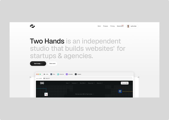
These heroes rely on strong messaging more than visuals. They work best when your value proposition needs explaining or when trust and clarity matter more than spectacle.
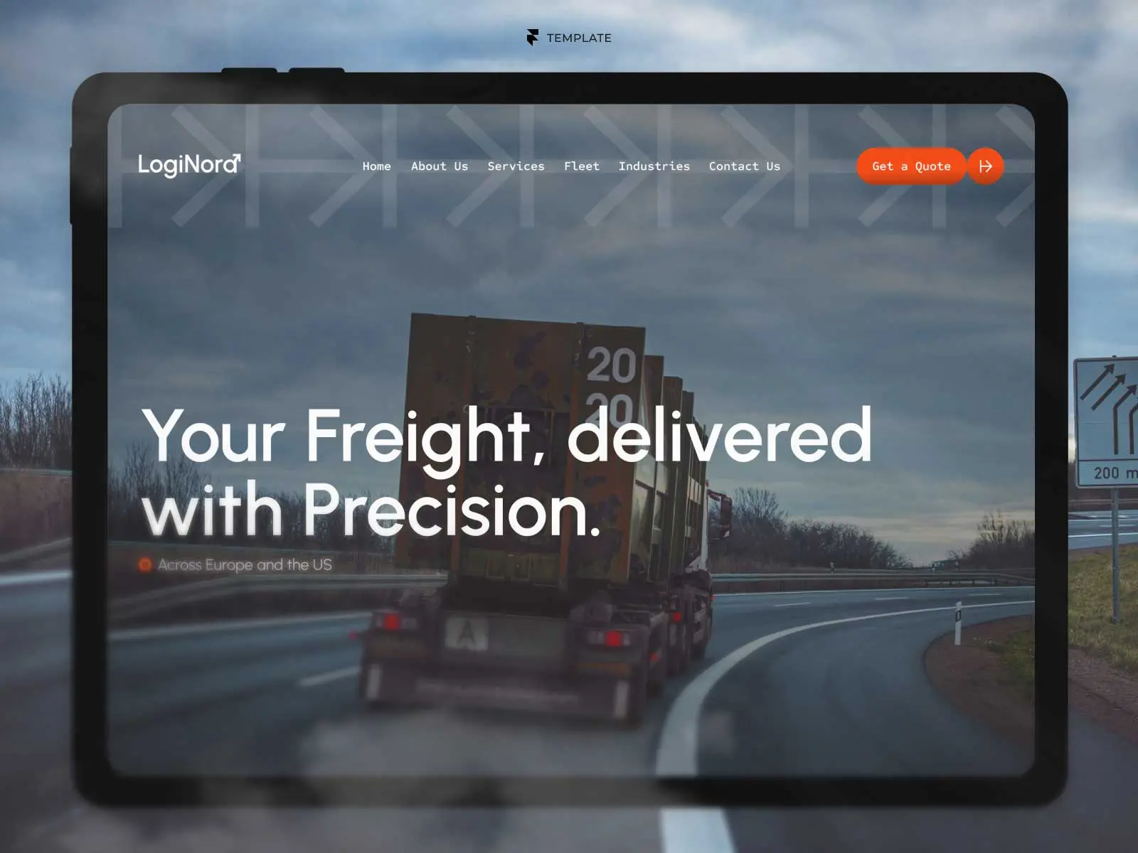
The Direct Statement — A large, single-sentence headline that states exactly what the product does, with no clever wordplay. Best for B2B tools and SaaS products where clarity beats cleverness.
The Problem-Solution Pair — Headline states the visitor's pain point; subheadline immediately presents the fix. Effective for service businesses and startups solving a specific frustration.
The Question Hook — Opens with a question the visitor is already asking themselves, pulling them into the rest of the page. Works well for consumer products and educational content.
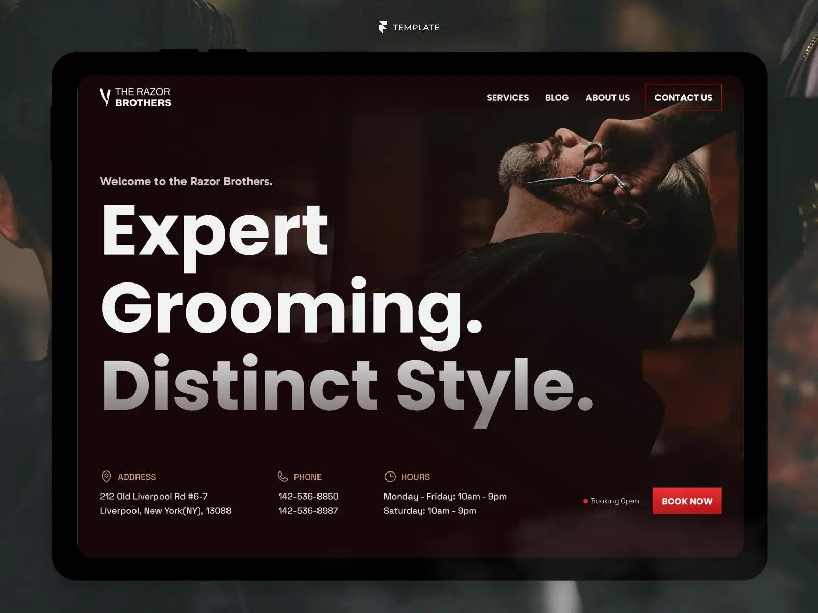
The Bold Claim — A confident, slightly provocative statement backed up immediately by proof points below the fold. Suits brands with strong personality or a genuine competitive edge.
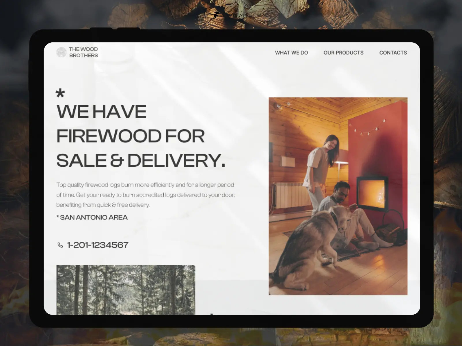
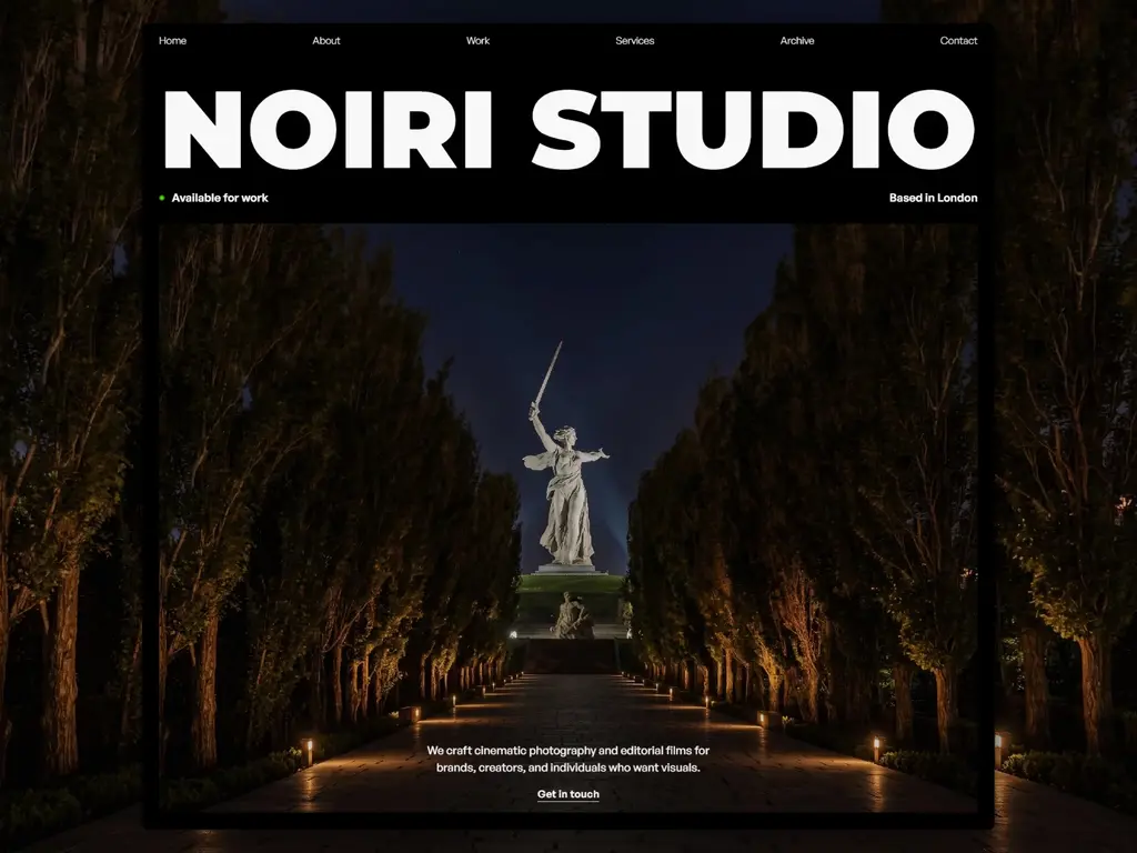
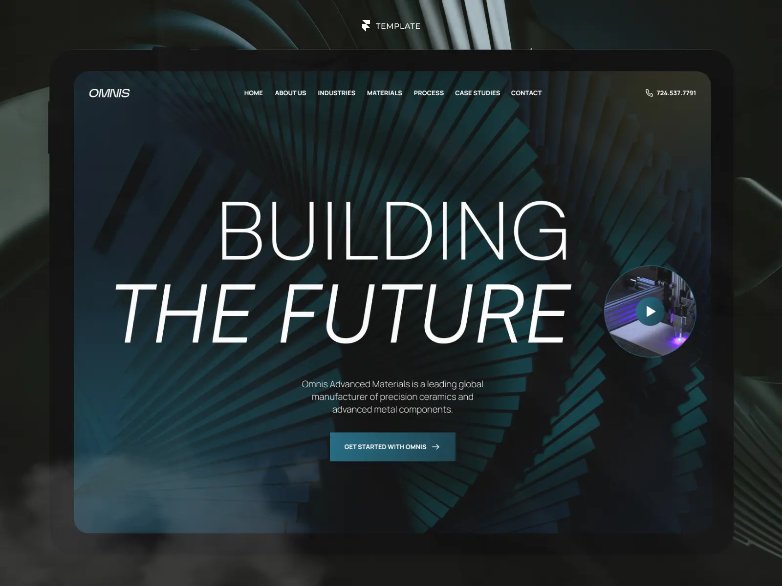
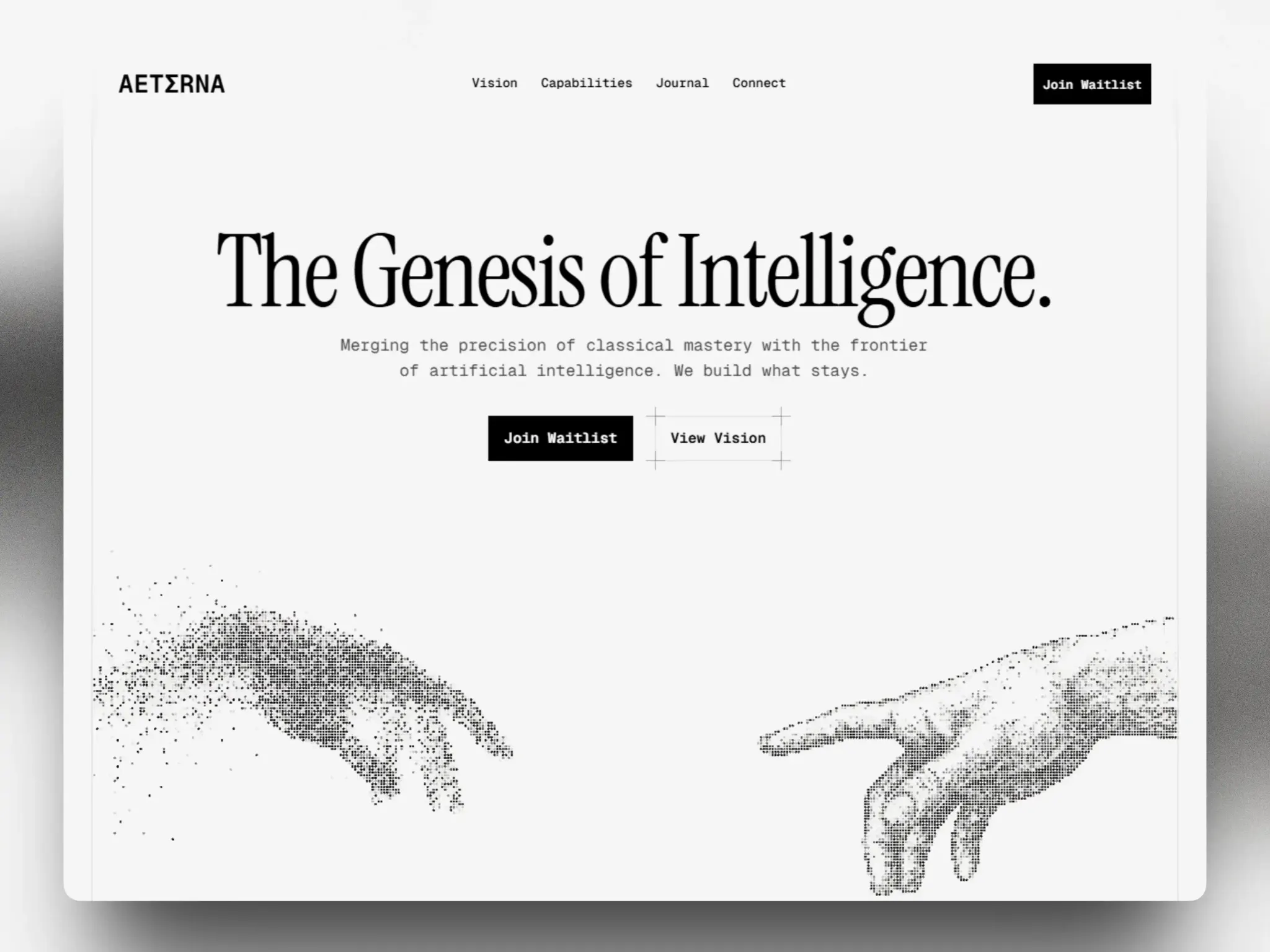
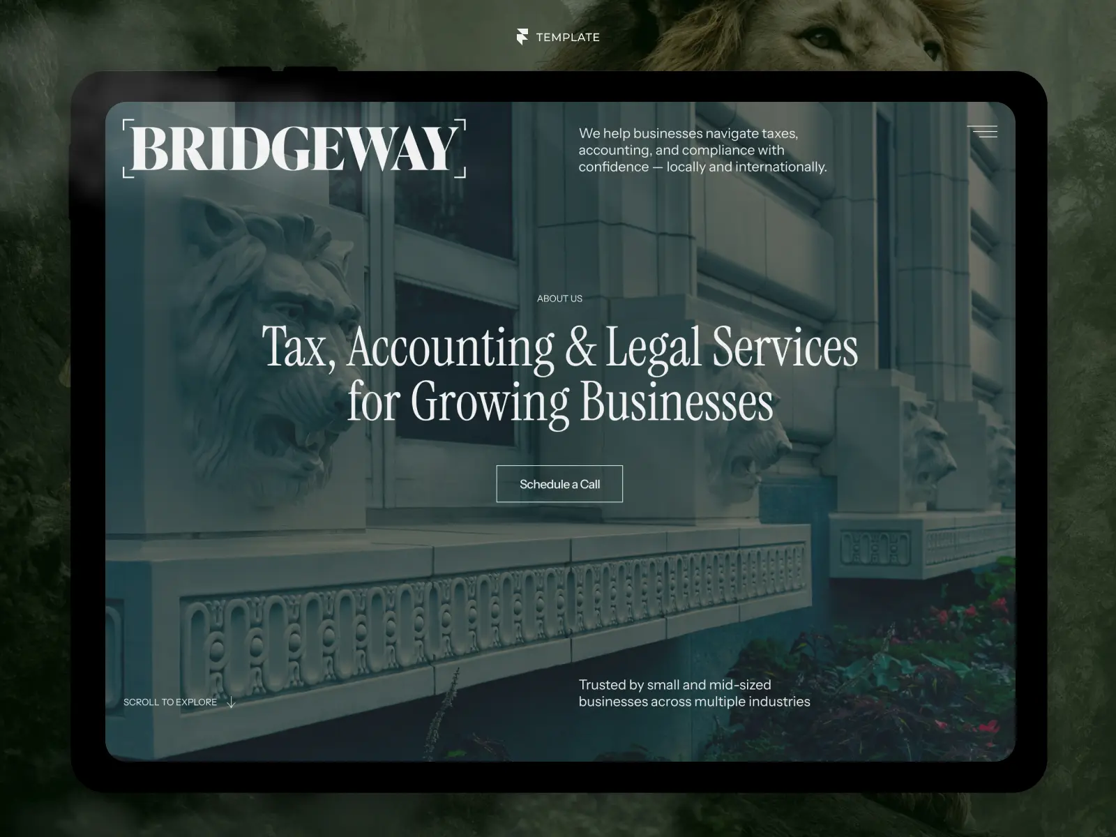
The Minimalist Statement — Just a few words, enormous type, huge whitespace. Best for premium or luxury brands where restraint signals confidence.
Pro Tip: If you're unsure which headline style fits your brand, write five versions in these different tones and read them out loud. The one that sounds most like how you'd explain your product to a friend is usually the right one.
Visual-Led Heroes
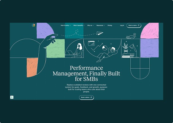
These heroes let imagery or motion carry the emotional weight, with copy playing a supporting role.
The Full-Bleed Product Shot — A large, high-quality image or mockup of the product fills most of the viewport. Ideal for physical products and app interfaces where seeing is believing.
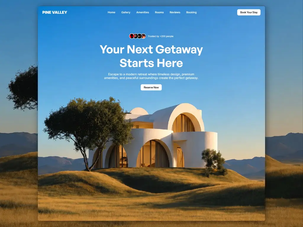
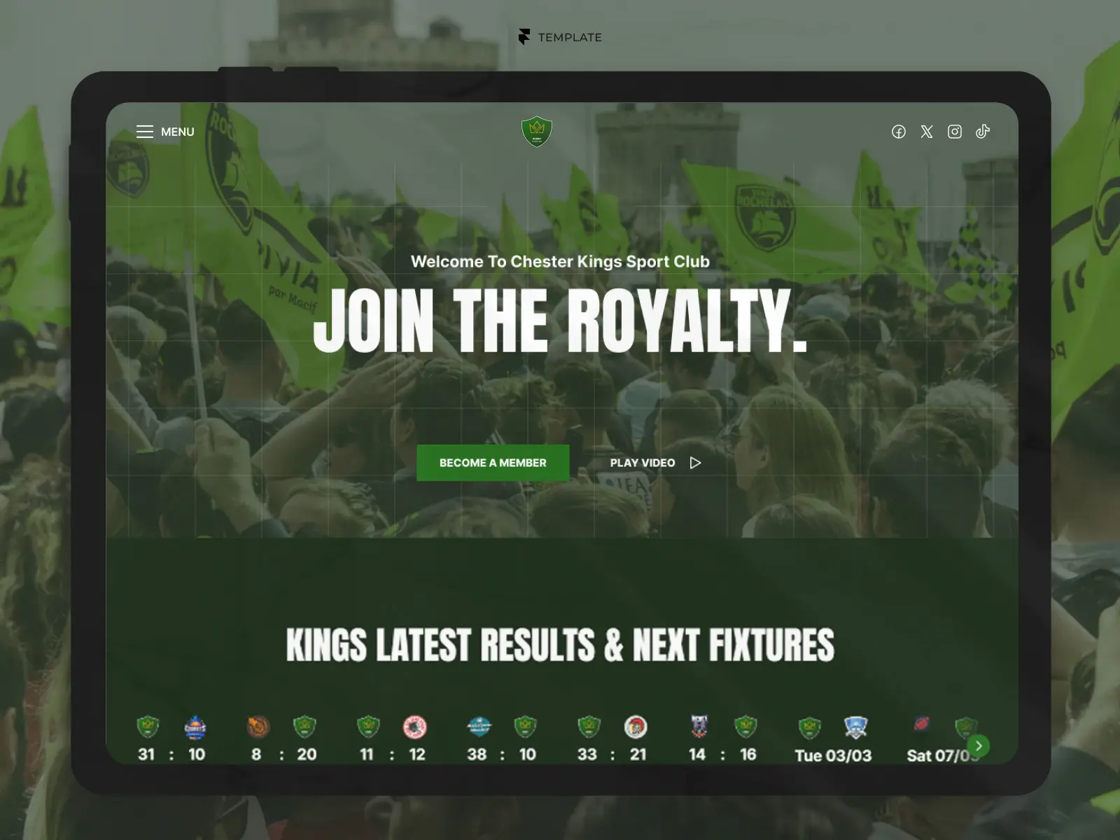
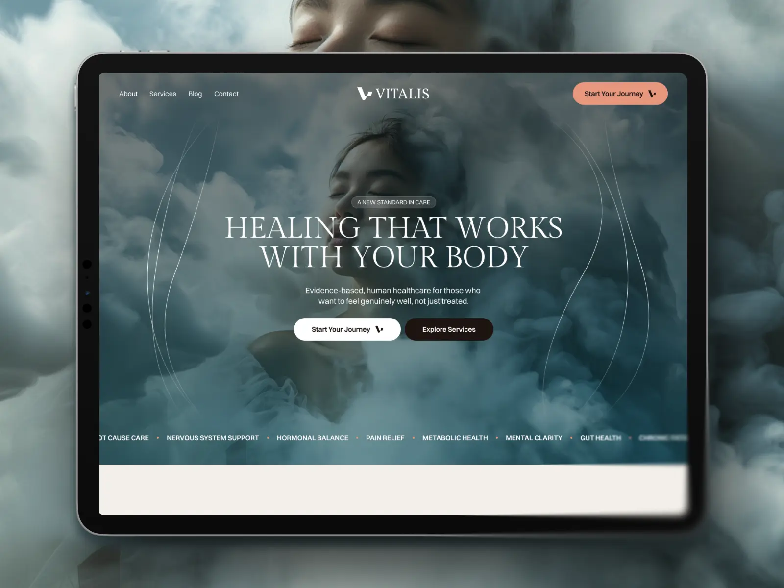
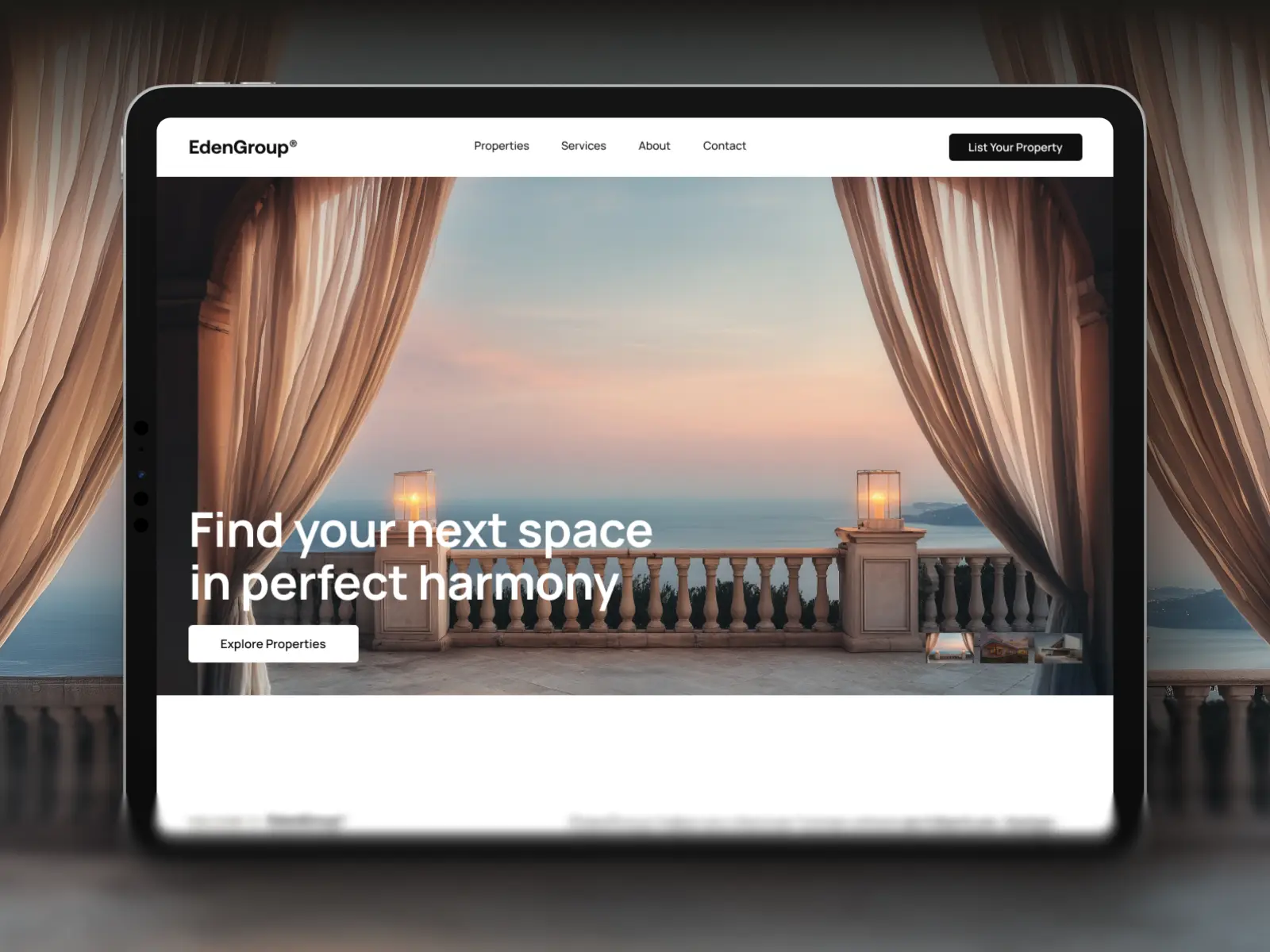
The Looping Video Background — Subtle, silent looping footage sets the mood behind the headline. Common for hospitality, travel, and lifestyle brands.
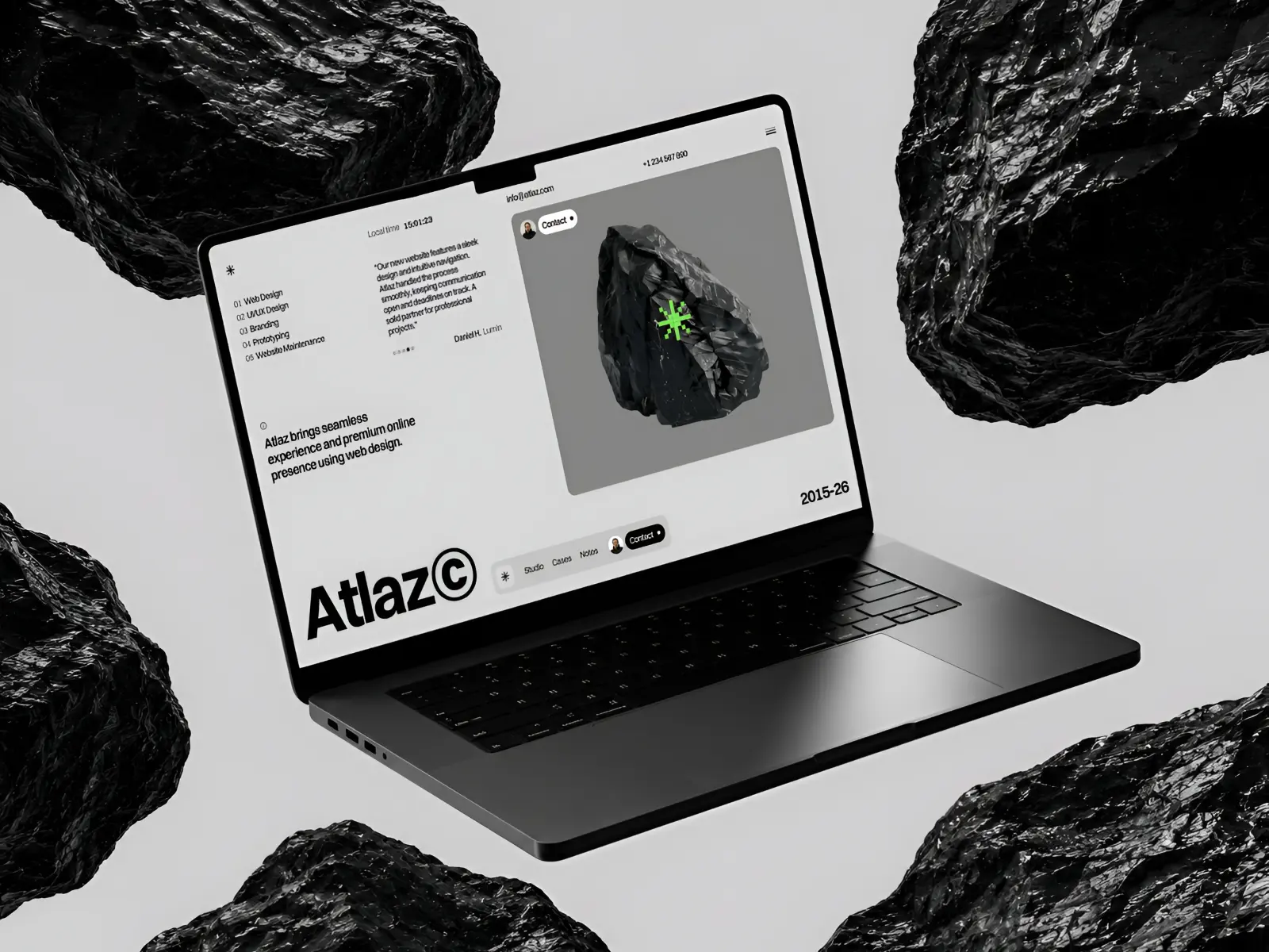
The Cursor-Reactive Scene — Elements shift or parallax slightly as the visitor moves their cursor, adding a layer of interactivity. Works well for creative agencies and portfolios.
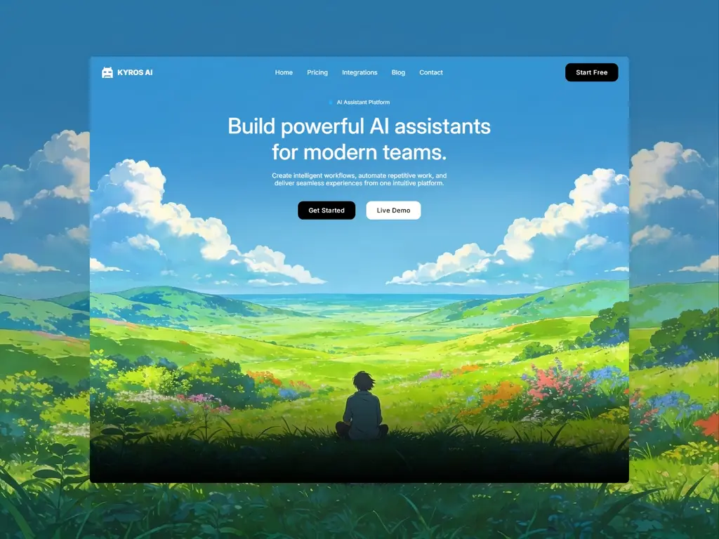
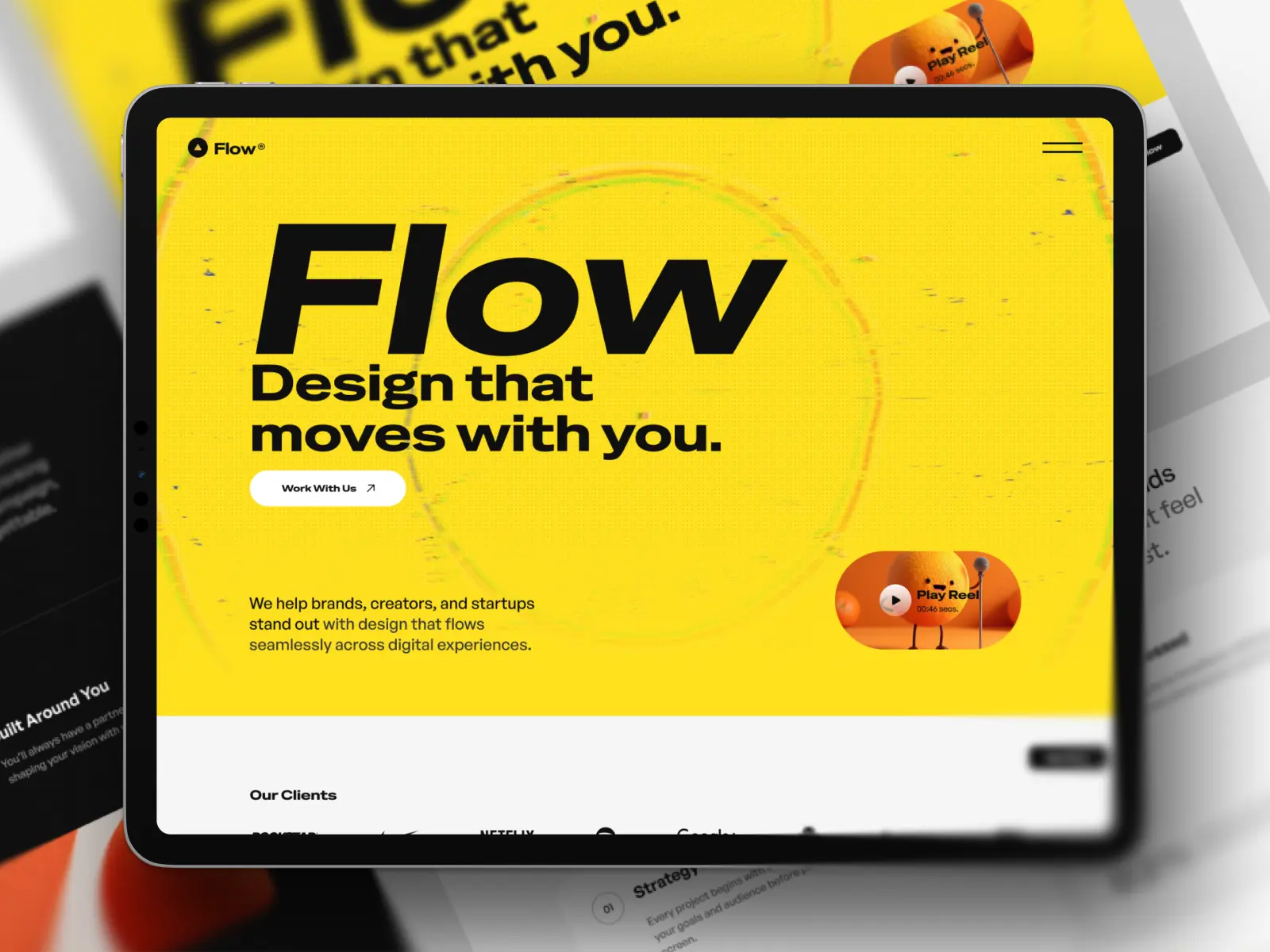
The Illustrated World — Custom illustration builds a distinct, ownable visual identity instead of relying on stock photography. Popular with fintech and consumer apps aiming for warmth.
The Split-Screen Contrast — Two halves of the screen show a before/after or two different states, reinforcing transformation. Effective for productivity tools and health or fitness brands.
Interactive and Product Demo Heroes
These heroes invite the visitor to do something immediately, rather than just read or watch.
The Embedded Live Demo — A working, simplified version of the product sits directly in the hero, letting visitors try before committing. Common for design tools and no-code platforms.
The Animated Product Walkthrough — A short, looping animation shows the product in action step by step. Works well when the value isn't obvious from a static screenshot alone.
The Input-First Hero — A single input field (search, email, or prompt box) is the primary call to action, front and center. Popular with AI tools and search-driven products.
The Configurator Preview — Visitors can toggle a variable — color, plan, or feature — and see the result update live. Effective for products with meaningful customization.
The Scroll-Triggered Reveal — Content assembles or expands as the visitor scrolls, turning the hero into a short guided sequence. Works well for storytelling-driven brands.
Common Mistake: Interactive heroes are powerful, but only if they load instantly. A demo or animation that stutters or takes too long to appear does more harm than a simple static hero ever would.
Social Proof and Trust-Led Heroes
These heroes lead with credibility rather than product features, useful when trust is the biggest barrier to conversion.
The Logo Wall Opener — Client or partner logos appear directly beneath the headline, establishing credibility before anything else. Common for agencies and enterprise software.
The Metric Spotlight — A single, impressive number (users served, revenue processed, time saved) anchors the hero as the headline itself. Works well when you have a genuinely strong statistic.
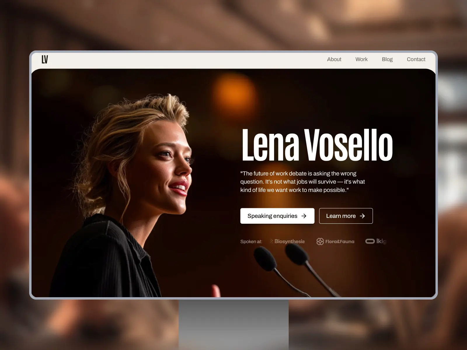
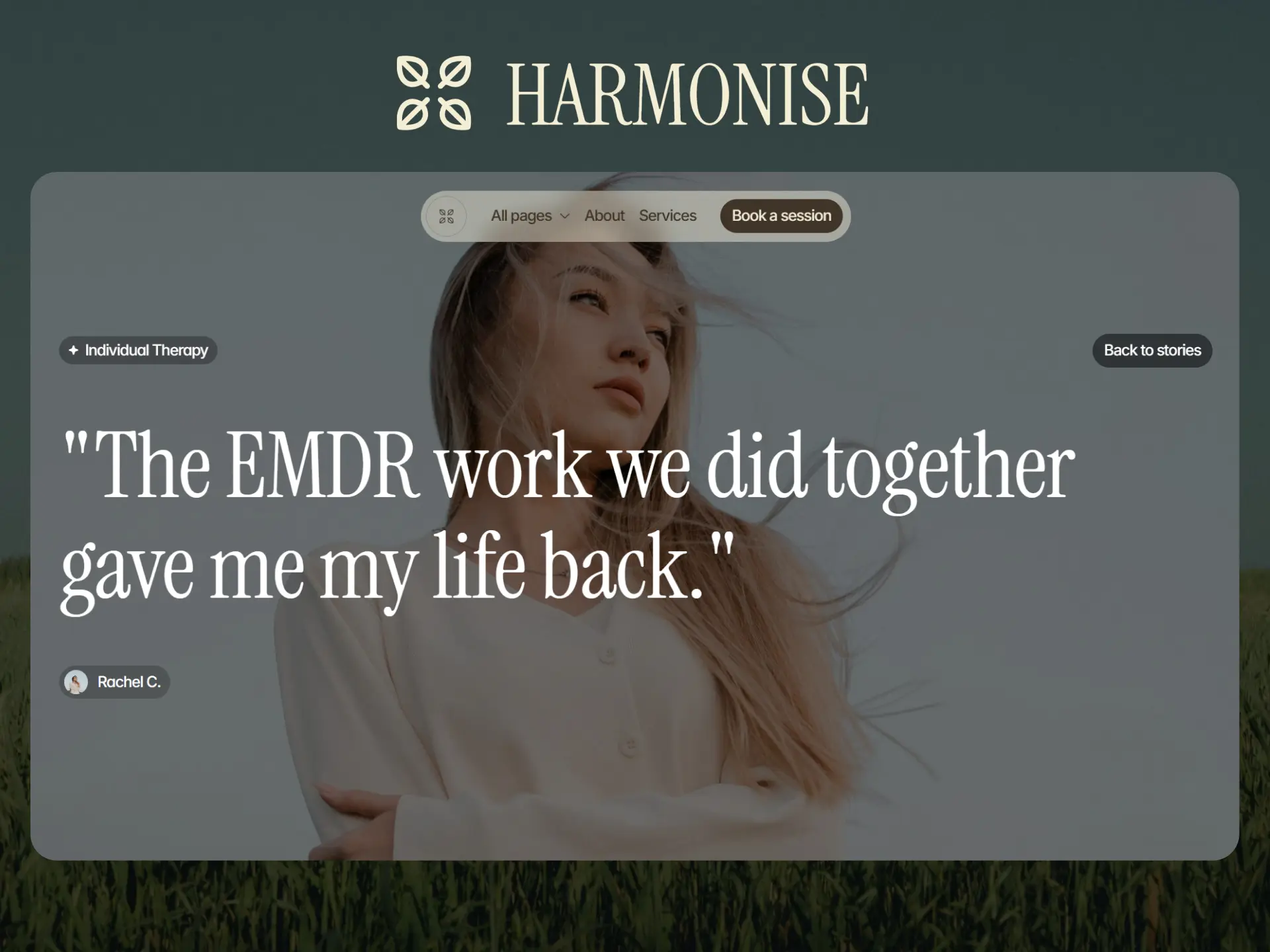
The Testimonial-First Hero — A short, specific customer quote sits alongside the headline rather than further down the page. Effective for service-based businesses and consultants.
Conversion-Focused Heroes
These heroes are built almost entirely around driving one specific action.
The Dual-Path CTA — Two clear buttons split visitors into distinct journeys (e.g., "For Businesses" / "For Individuals"), reducing friction for mixed audiences. Common for platforms serving multiple user types.
The Urgency-Driven Hero — Combines a strong offer with a visible deadline, countdown, or limited availability. Best suited for launches, sales events, or waitlist campaigns — used sparingly so it doesn't undercut trust.
Choosing the Right Hero for Your Site
With 20 strong options, the challenge isn't finding a good hero — it's picking the one that matches your actual goal. Ask yourself:
Does my audience need convincing, or do they already know what they want?
Is my biggest strength my messaging, my visuals, or my product itself?
What's the one action I most want a first-time visitor to take?
How much time and budget do I have to build something interactive versus static?
Once you can answer those questions clearly, the right hero style usually becomes obvious.
Key Takeaways
Every effective hero section leads with either strong copy, strong visuals, strong interactivity, or strong proof — pick the strength that matches your brand.
Interactive heroes only work if they load fast and feel effortless; performance issues undermine the whole effect.
Trust-led heroes are especially valuable when your audience needs reassurance before engaging further.
The best hero for your site depends on your specific goal, not on what looks impressive in isolation.
Test your hero section with real visitors whenever possible — what feels compelling to you may not be what converts.

Try Systeme.io
Your website is only the beginning.
Take your Framer site further with funnels, email marketing, automation, bookings and more.


AFFILIATE PARTNER