16 min read
15 best Framer websites for Design inspiration (2026 Edition)
The best designers don't copy great websites. They study them.
Looking closely at how exceptional websites use typography, layout, motion, and storytelling is one of the fastest ways to improve your own design skills.
That's exactly what this collection is about.
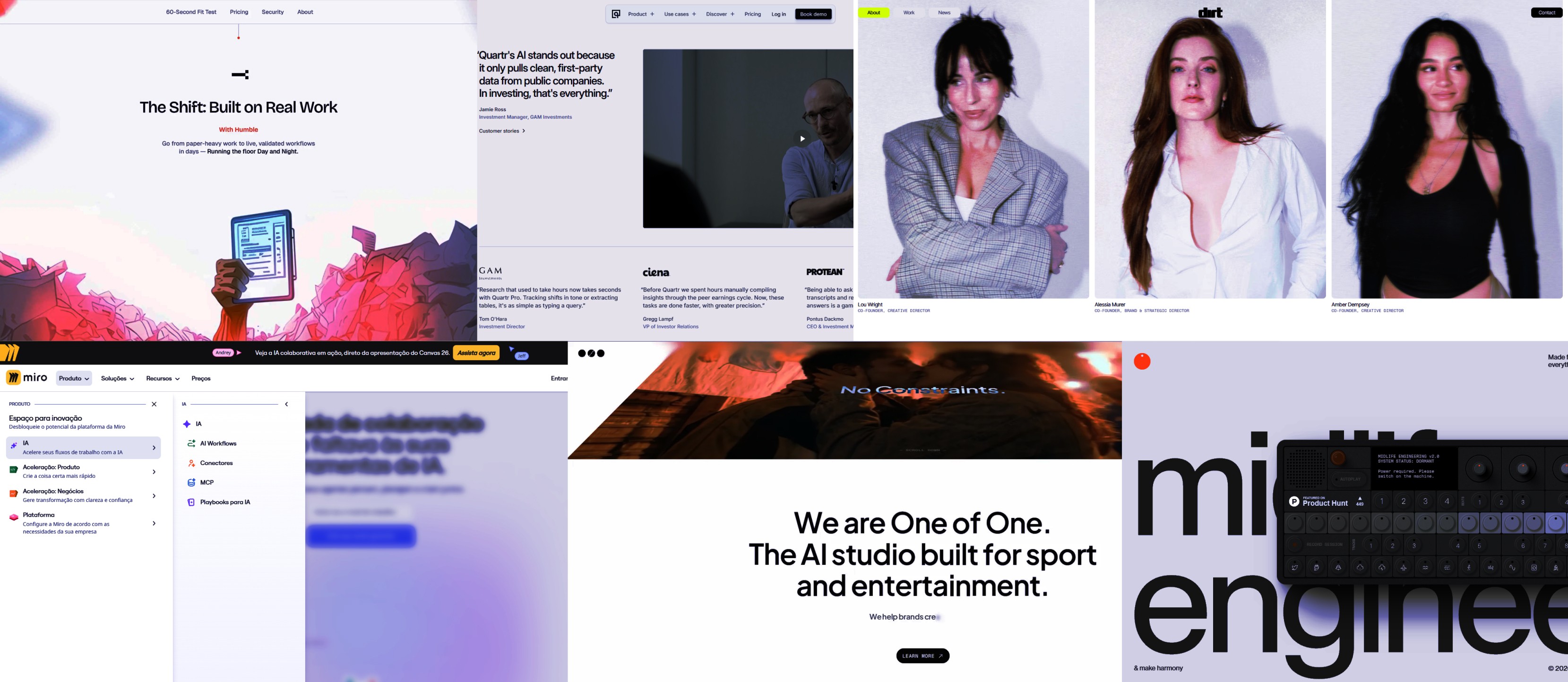
Rather than simply showcasing beautiful websites, we've hand-picked 15 Framer websites that each excel in a specific area of web design. Some demonstrate outstanding typography. Others use motion to guide attention, build trust through thoughtful layouts, or create memorable user experiences with remarkable restraint.
More importantly, every website in this list has something practical to teach.
Whether you're designing a SaaS landing page, an agency website, a personal portfolio, or your next Framer template, these examples offer ideas you can apply to your own work.
Let's dive in.
Website | Category | Best For |
|---|---|---|
Miro | SaaS | Information Architecture |
Humble Factory | AI / B2B | Visual Hierarchy |
Midlife Engineering | Creative | Motion & Storytelling |
Jackie Zhang | Portfolio | Personal Brand Storytelling |
Addverb.ai | B2B | Product Presentation |
Quartr | SaaS | Clarity & UX |
FLER Studio | Creative Agency | Art Direction |
Symbol Studio | Design Agency | Typography |
Studio Mirabelli | Creative Studio | Agency Positioning |
Mosaic | Enterprise | UX & Layout Systems |
One of One | AI | Product Marketing |
Laundry Loft | Local Business | Brand Personality |
Heat Bureau | Agency | Premium Branding |
Dirtverse | Creative | Creative Direction |
Paysages Studio | Design Studio | Editorial Composition |
1. Miro
Best Information Architecture
Website: https://miro.com/
Category: SaaS
Why It Stands Out
Designing a beautiful landing page is relatively straightforward.
Designing a website that supports millions of users, hundreds of product pages, documentation, templates, customer stories, integrations, and educational resources—while still feeling intuitive—is an entirely different challenge.
That's what makes Miro such an impressive example.
Rather than relying on flashy animations or unconventional layouts, Miro demonstrates how thoughtful information architecture can become a competitive advantage. Despite the sheer amount of content available, the website rarely feels overwhelming. Navigation is organised into logical groups, pages follow consistent structures, and users are always given a clear sense of where to go next.
Another standout aspect is how the site balances the needs of different audiences. A first-time visitor can quickly understand what Miro does and start a free trial, while existing customers, developers, enterprise buyers, and educators can all find highly specific resources without disrupting the experience for everyone else.

The visual hierarchy plays an equally important role.
Large headlines communicate the main message, supporting copy provides context, and call-to-action buttons remain consistently visible throughout the journey. Every page feels designed to reduce cognitive load, allowing visitors to focus on the information that matters most instead of navigating unnecessary complexity.
Perhaps the most impressive achievement is consistency.
Whether you're browsing a product page, reading customer stories, exploring templates, or visiting the help centre, the overall experience feels cohesive. Components, spacing, typography, colours, and interactions all work together to create a familiar environment that scales across hundreds of pages.
For designers building growing products or content-rich websites, Miro is an excellent reminder that great UX isn't about adding more features—it's about making complexity feel simple.
What Designers Can Learn
Organise navigation around user goals, not your company's internal structure.
Use consistent page layouts to reduce cognitive load across large websites.
Create a clear visual hierarchy that naturally guides users toward key actions.
Design systems become increasingly valuable as websites grow in size and complexity.
Steal This Idea 💡
Instead of trying to expose every page in your navigation, organise information into clear layers.
Miro reveals complexity progressively, allowing new visitors to focus on understanding the product while still giving experienced users quick access to advanced resources. This approach keeps the interface approachable without limiting discoverability.
2. Humble Factory
Best Visual Hierarchy
Website: https://humblefactory.ai/
Category: AI / B2B
Why It Stands Out
One of the biggest challenges in web design is knowing where users should look first.
Many websites try to communicate everything at once, competing for attention with oversized headlines, animated backgrounds, colourful illustrations, and multiple calls to action. The result is often visual noise rather than clarity.
Humble Factory takes the opposite approach.
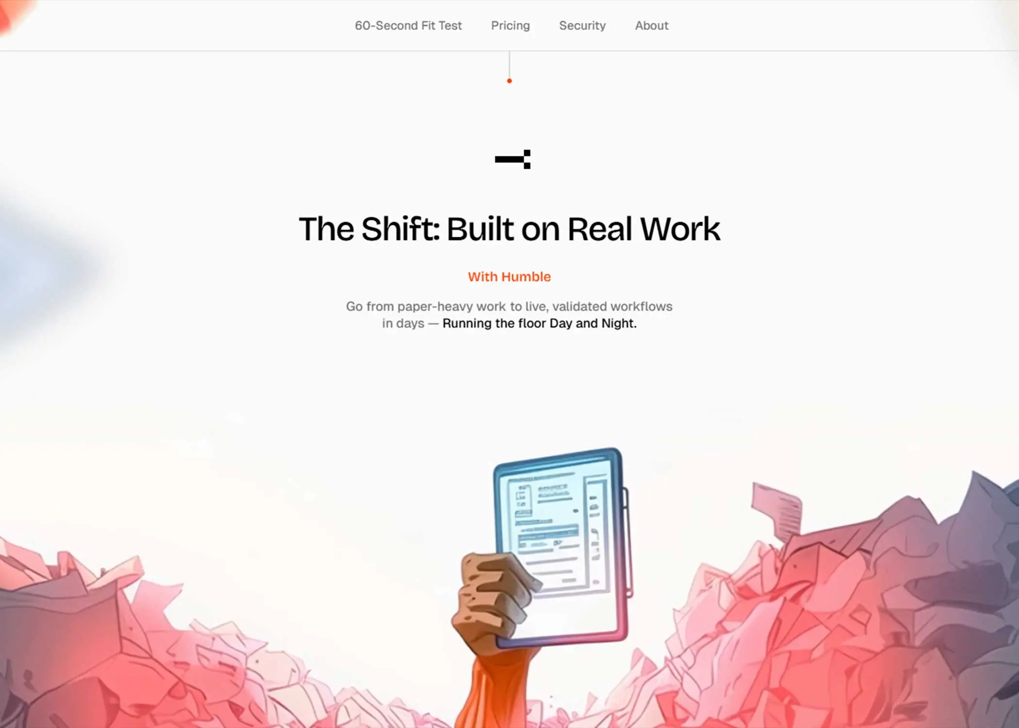
From the moment the page loads, there's an obvious reading path. Your eyes naturally move from the headline to the supporting copy, then to the primary call to action, before exploring the rest of the page. Nothing feels accidental.
This is achieved through a careful combination of typography, spacing, contrast, and content density.
Instead of filling every section with visual elements, the design creates breathing room around the most important information. Headlines are bold without being oversized, supporting copy is concise, and imagery reinforces the message rather than competing with it.
Another aspect worth studying is the rhythm of the page.
As you scroll, each section introduces a single idea before smoothly transitioning to the next. There are no abrupt layout changes or competing visual styles. Every block feels like a continuation of the previous one, creating a reading experience that's both engaging and easy to follow.
Motion also plays an important supporting role.
Animations are subtle and purposeful, helping reveal content progressively without distracting from the message. They're used to reinforce hierarchy—not replace it.
This restraint is what makes the website feel polished.
Rather than relying on visual effects to create impact, Humble Factory demonstrates that strong hierarchy is often the most powerful design tool of all.
What Designers Can Learn
Guide attention by controlling typography, spacing, and contrast—not just colour.
Give each section a single purpose before moving on to the next.
Use whitespace to emphasise important content rather than filling every available space.
Treat animations as supporting elements, not the main attraction.
Steal This Idea 💡
Review every section of your homepage and ask yourself one simple question:
"What is the first thing I want visitors to notice?"
If the answer isn't immediately obvious, your hierarchy probably needs work.
Reduce competing elements, simplify the layout, and allow one message to dominate before introducing the next. Clear visual hierarchy almost always leads to a better user experience.
3. Midlife Engineering
Best Motion & Storytelling
Website: https://www.midlife.engineering/
Category: Creative Experience
Why It Stands Out
Animation is one of the most misunderstood aspects of modern web design.
Too often, websites rely on motion simply because they can. Elements fade in, scale up, slide across the screen, or rotate without contributing anything meaningful to the user's experience.
Midlife Engineering takes a completely different approach.
Here, motion isn't decoration—it's storytelling.
Every transition, scroll interaction, and visual movement serves a purpose. Instead of competing for attention, animations help establish rhythm, reveal information progressively, and create a sense of anticipation as visitors move through the experience.
The website feels carefully choreographed.
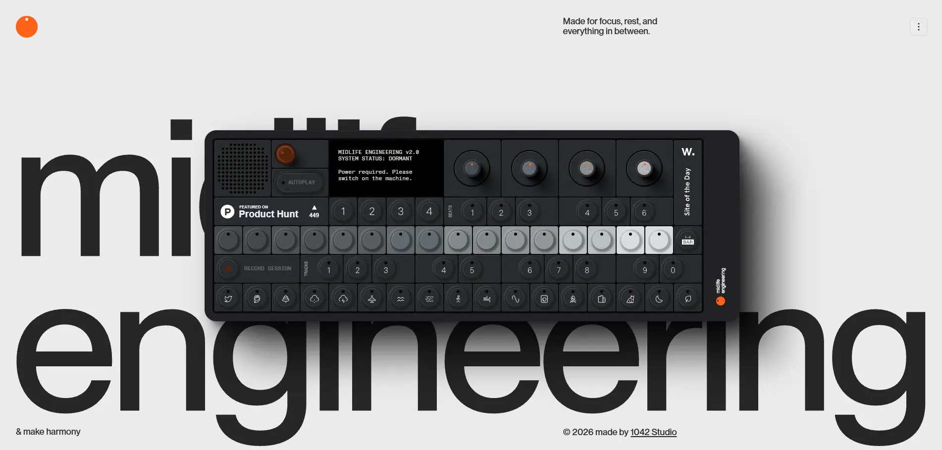
Rather than presenting all the information at once, content unfolds at a measured pace. This encourages visitors to slow down and engage with the story, making the experience feel more immersive without ever becoming overwhelming.
Another aspect that stands out is the confidence to let content breathe.
Many websites use animation to compensate for weak layouts. Midlife Engineering does the opposite. The layouts are already strong, and motion simply enhances them. Sections have room to breathe, typography remains readable throughout, and interactions feel intentional rather than excessive.
Perhaps the most valuable lesson is restraint.
Despite being highly interactive, the website never feels like a collection of visual tricks. The animations always support the narrative, reinforcing the brand rather than distracting from it.
That's what separates memorable motion design from motion for the sake of motion.
What Designers Can Learn
Use animation to guide users through a story, not simply to attract attention.
Reveal information progressively instead of presenting everything at once.
Build strong layouts first, then use motion to enhance them.
Establish a consistent rhythm that makes scrolling feel natural and enjoyable.
Steal This Idea 💡
Before adding an animation, ask yourself:
"If I removed this animation, would the experience become less clear?"
If the answer is no, the animation probably isn't adding value.
The best motion design improves understanding, reinforces hierarchy, or strengthens the story. Everything else is just visual noise.
4. Jackie Zhang
Best Portfolio Storytelling
Website: https://jackiezhang.co.za/
Category: Portfolio
Why It Stands Out
The best portfolio websites don't try to impress visitors within the first five seconds.
They build curiosity.
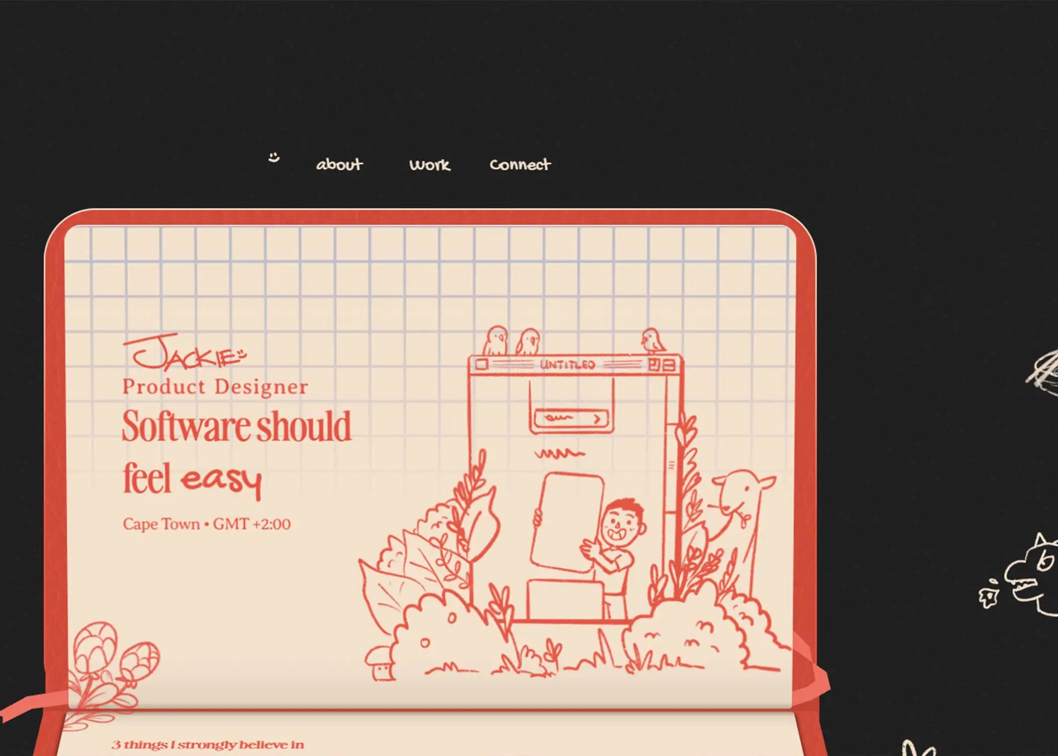
Jackie Zhang's portfolio is a great example of this approach. Rather than overwhelming visitors with flashy animations or a long list of projects, the website introduces the designer through a carefully paced narrative. Every section answers a simple question: Who is this designer, what do they do, and why should I keep scrolling?
That sense of progression is what makes the experience so engaging.
Instead of treating projects as isolated case studies, the website presents them as chapters in a broader story. Each transition feels intentional, creating a natural flow from personal introduction to selected work, process, and expertise.
Typography plays an equally important role.
Rather than competing with the visuals, it creates structure and rhythm. Large headlines establish clear entry points, while concise supporting copy provides enough context without interrupting the pace of the page.
Another strength is the confidence to leave things unsaid.
Many portfolio websites try to explain every project in detail, often resulting in long paragraphs that few visitors actually read. Jackie Zhang's portfolio trusts the work itself, using carefully chosen copy and visual hierarchy to spark curiosity rather than answer every possible question immediately.
This creates a portfolio that feels personal without becoming self-indulgent, and professional without feeling overly corporate.
What Designers Can Learn
Tell a story instead of presenting a collection of projects.
Build curiosity before asking visitors to explore your work.
Let typography create rhythm and structure throughout the page.
Trust visual communication instead of explaining everything with text.
Steal This Idea 💡
Think of your portfolio as a conversation rather than a gallery.
Instead of asking visitors to browse your projects immediately, spend the first few moments helping them understand who you are, how you think, and what makes your work different.
When people connect with the designer first, they're often far more interested in exploring the work that follows.
5. Addverb.ai
Best B2B Product Presentation
Website: https://addverb.ai/
Category: B2B / Industrial Technology
Why It Stands Out
Designing websites for industrial and enterprise companies is often more challenging than designing for startups.
The products are usually more complex, the buying journey is longer, and the audience expects credibility before creativity.
Addverb.ai handles this balance exceptionally well.
Instead of overwhelming visitors with technical specifications from the very beginning, the website starts by communicating a clear value proposition. It explains what the company does, why it matters, and only then begins introducing the technologies behind the solution.
This gradual increase in complexity makes the experience feel approachable, even for visitors who aren't already familiar with industrial automation.
Another strength is how the website combines visuals with content.
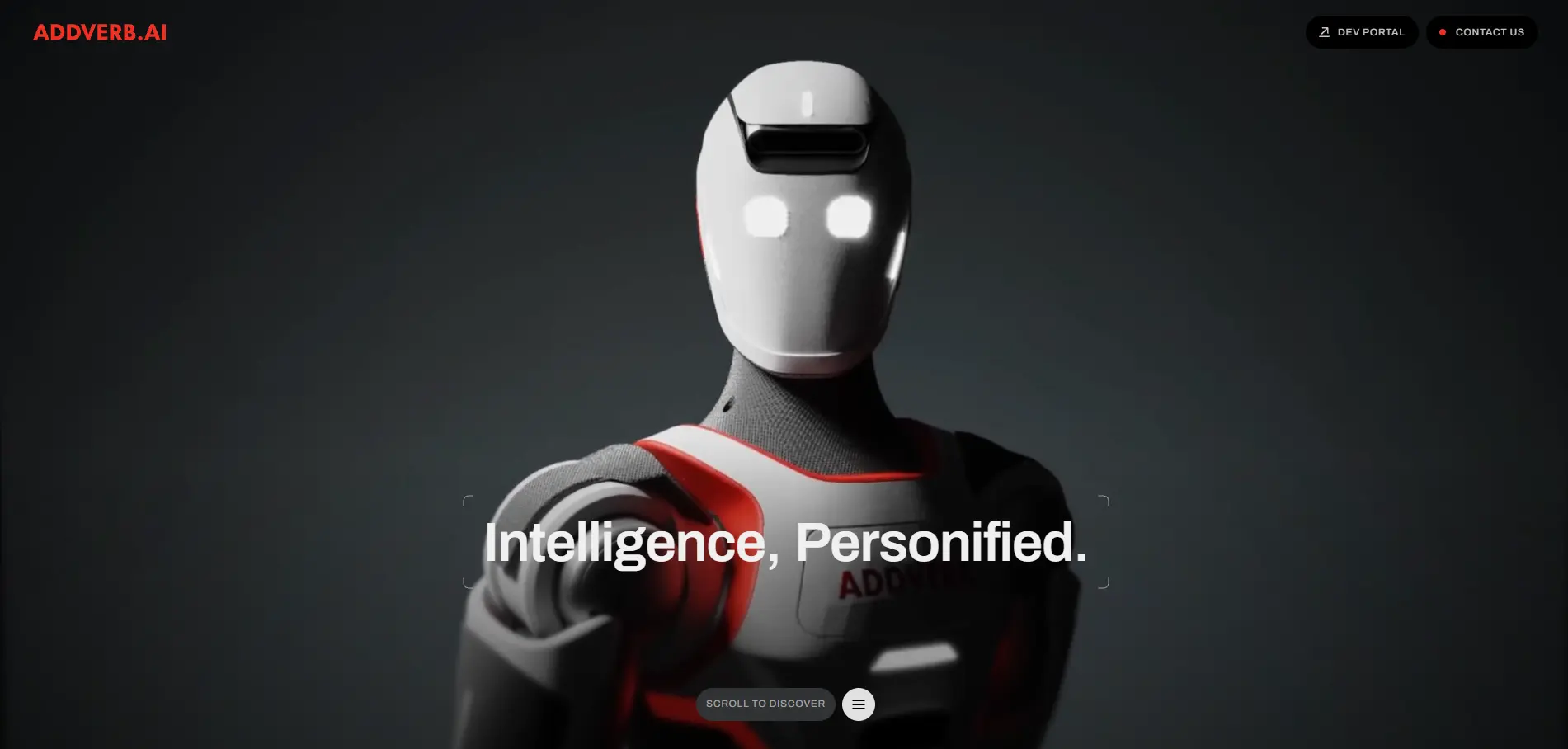
Product renders, photography, diagrams, and supporting copy work together rather than competing for attention. Each visual answers a question that the text introduces, creating a seamless relationship between explanation and illustration.
The page structure deserves attention as well.
Every section has a clear objective. One introduces the company's vision, another explains the technology, while the following sections build trust through industries, products, and customer success. This progression mirrors the way real buying decisions are made, taking visitors from awareness to understanding before asking them to explore further.
Despite the amount of information presented, the experience never feels heavy.
Strong spacing, restrained animations, and consistent typography create enough breathing room for visitors to absorb complex content without feeling overwhelmed.
For designers working on B2B, manufacturing, engineering, or enterprise websites, Addverb.ai is an excellent reminder that simplicity doesn't mean removing information—it means organising it effectively.
What Designers Can Learn
Introduce complex products gradually instead of explaining everything at once.
Use visuals to clarify information, not simply to decorate the page.
Structure pages around the customer's decision-making journey.
Build trust before asking visitors to take action.
Steal This Idea 💡
When designing for technical industries, resist the temptation to showcase every feature immediately.
Instead, answer one question at a time.
Start with "Why does this matter?", then explain "How does it work?", and only afterwards explore the technical details.
Visitors are far more likely to engage with complex products when information is introduced progressively rather than all at once.
6. Quartr
Best SaaS Clarity
Website: https://quartr.com/
Category: SaaS / FinTech
Why It Stands Out
One of the hardest challenges in SaaS design is explaining a complex product without overwhelming potential customers.
Many companies fall into the same trap: they try to communicate every feature, every integration, and every possible use case on the homepage. Instead of creating clarity, they create friction.
Quartr takes a much more disciplined approach.
From the very first screen, the website answers three essential questions:
What is the product?
Who is it for?
Why should I care?
Only after establishing that foundation does it begin introducing individual features, workflows, and product capabilities.
This creates a remarkably smooth reading experience.
Every section builds naturally on the previous one. Instead of jumping between unrelated topics, the content follows a logical progression, helping visitors understand the product before asking them to evaluate it.
Visual hierarchy reinforces this clarity.
The interface screenshots are large enough to demonstrate the product without dominating the page, supporting copy remains concise, and generous spacing prevents information from feeling compressed.
Another detail worth studying is the consistency of the design system.
Buttons, cards, typography, colours, and layouts remain remarkably uniform throughout the website. This consistency reduces cognitive load and allows visitors to focus entirely on understanding the product.
The result is a website that feels calm, confident, and trustworthy—qualities that are especially important in financial technology, where credibility is often just as important as innovation.
What Designers Can Learn
Explain the problem before introducing product features.
Guide visitors through a logical narrative instead of presenting isolated sections.
Keep interface previews focused on supporting the message rather than replacing it.
Build trust through consistency rather than visual complexity.
Steal This Idea 💡
Imagine removing half the content from your homepage.
Would visitors still understand what your product does?
Quartr demonstrates that clarity rarely comes from adding more information. It comes from carefully choosing what deserves attention first and delaying everything else until the right moment.
7. FLER Studio
Best Art Direction
Website: https://www.flerdesign.com/
Category: Creative Agency
Why It Stands Out
Strong visual design isn't about using the latest trends.
It's about making every design decision feel like part of the same creative vision.
FLER Studio is an excellent example of this principle.
From the very first interaction, the website establishes a clear visual language that remains remarkably consistent throughout the experience. Typography, colour, imagery, motion, spacing, and composition all feel intentionally connected, creating a strong sense of identity that never relies on excess.
One of the most impressive aspects of the website is its confidence.
Many agency websites try to showcase every design technique they know, combining bold typography, complex animations, gradients, glassmorphism, oversized imagery, and experimental layouts into a single experience.
FLER Studio chooses restraint instead.
Every element feels carefully considered. Motion enhances the experience without becoming the main attraction, while generous spacing gives each section room to breathe. The result is a website that feels premium not because it does more, but because it does fewer things exceptionally well.
The photography and visual assets deserve attention too.
Rather than feeling like decorative additions, they're fully integrated into the overall composition. Every image supports the brand's personality and contributes to the same visual narrative.
Perhaps the biggest lesson is consistency.
Even as layouts change from page to page, the visual identity never does. Visitors always know they're interacting with the same brand because every component follows the same design principles.
That's what separates a visually attractive website from one with truly memorable art direction.
What Designers Can Learn
Establish a clear visual language before designing individual pages.
Resist the temptation to combine every design trend into a single project.
Use imagery, typography, and motion to reinforce the same creative vision.
Consistency creates stronger branding than constant visual variation.
Steal This Idea 💡
Before designing your homepage, define three visual principles that will guide every design decision.
For example:
Minimal typography.
Soft, restrained motion.
Editorial-inspired layouts.
Every new section should reinforce those principles rather than introduce something completely different.
The strongest brands aren't recognised because every page looks unique—they're recognised because every page feels unmistakably connected.
8. Symbol Studio
Best Typography
Website: https://www.symbolstudio.pl/en/
Category: Design Studio
Why It Stands Out
Typography is often treated as the finishing touch of a website.
In reality, it's one of the most important design decisions you'll make.
A well-designed typographic system doesn't just improve readability—it establishes rhythm, reinforces hierarchy, and shapes how visitors experience every page.
Symbol Studio demonstrates this exceptionally well.
Rather than relying on oversized headlines or decorative typefaces to create impact, the website builds its identity through a carefully balanced typographic system. Every heading, paragraph, caption, and label feels intentional, creating a reading experience that's both elegant and effortless.
One of the most impressive aspects of the design is its restraint.
There's no constant variation in font weights, colours, or styles competing for attention. Instead, hierarchy is created through proportion, spacing, and positioning. This gives the website a calm, editorial quality that feels sophisticated without ever becoming sterile.
Spacing plays an equally important role.
Generous margins, consistent line lengths, and comfortable line heights allow the content to breathe, making even longer sections easy to scan. The typography doesn't simply present information—it controls the pace at which the page is consumed.
Another lesson worth studying is consistency.
The same visual rules apply across every page, creating a unified reading experience that strengthens the brand without demanding attention.
It's a reminder that typography isn't just about choosing the right font.
It's about building a system that supports every piece of content on the website.
What Designers Can Learn
Build hierarchy through scale and spacing before introducing additional styles.
Limit unnecessary font weights and decorative treatments.
Use whitespace to improve readability, not just aesthetics.
Think of typography as a system rather than a collection of individual styles.
Steal This Idea 💡
Try designing your next homepage in black and white before adding colour.
If your typography alone creates a clear hierarchy and an enjoyable reading experience, you've already solved one of the most important challenges in web design.
Colour, imagery, and animation should enhance good typography—not compensate for weak typography.
9. Studio Mirabelli
Best Agency Positioning
Website: https://www.studio-mirabelli.com/
Category: Creative Studio
Why It Stands Out
Most agency websites focus almost exclusively on showcasing their work.
Studio Mirabelli takes a different approach.
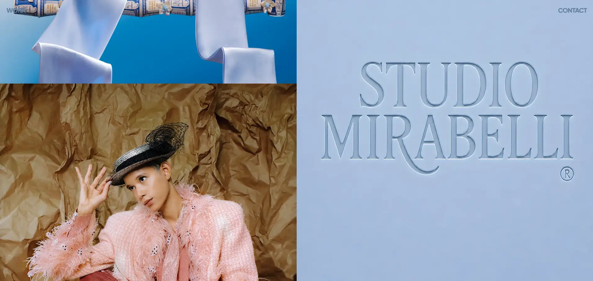
Rather than simply presenting a portfolio of finished projects, the website communicates a clear point of view. From the first screen, you get a strong sense of the studio's personality, creative philosophy, and the type of clients they want to work with.
That distinction is important.
Potential clients aren't just looking for beautiful visuals—they're looking for a team they can trust. Studio Mirabelli understands this, using carefully crafted messaging alongside a refined visual identity to create credibility long before visitors reach the project gallery.
The structure of the website reinforces this positioning.
Instead of rushing visitors into case studies, the experience gradually introduces the studio's approach, capabilities, and values before showcasing selected work. This creates context, helping each project feel like evidence of the studio's expertise rather than a standalone visual showcase.
Another detail worth studying is the balance between confidence and restraint.
The website feels premium without trying too hard. Typography is clean, layouts are spacious, and interactions remain subtle throughout the experience. Nothing distracts from the core message, allowing the work—and the thinking behind it—to remain the focus.
It's a reminder that successful agency websites don't just answer the question "What have you built?"
They answer the far more important question:
"Why should someone choose to work with you?"
What Designers Can Learn
Position your agency around a clear perspective, not just a collection of projects.
Introduce your approach before presenting your portfolio.
Use messaging to build trust alongside visual design.
Let consistency communicate professionalism rather than relying on visual effects.
Steal This Idea 💡
Imagine hiding every project on your website.
Would visitors still understand what makes your agency different?
If the answer is no, your positioning probably depends too much on your portfolio.
The strongest agency websites communicate their philosophy first, then use their work to reinforce it. Clients don't hire portfolios—they hire the people and thinking behind them.
10. Mosaic
Best UX & Layout Systems
Website: https://mosaic.select/
Category: Enterprise
Why It Stands Out
Good layouts often go unnoticed.
When content feels easy to scan, sections flow naturally, and information appears exactly where users expect it, most visitors never stop to think about the design decisions behind the experience.
That's precisely what makes Mosaic such a valuable website to study.
Rather than relying on dramatic visuals or unconventional interactions, the website demonstrates how a well-designed layout system can quietly improve usability across an entire experience.
Every page follows a clear structural logic.
Content blocks maintain consistent spacing, text widths remain comfortable to read, and visual elements align predictably throughout the site. This consistency creates a sense of familiarity, allowing visitors to focus on the content instead of constantly adapting to new layouts.
The grid deserves particular attention.
Whether displaying large headlines, multi-column sections, statistics, or image galleries, the underlying structure remains remarkably disciplined. Even when the content changes significantly, the layout never feels inconsistent or improvised.
Another strength is the relationship between content and whitespace.
Instead of treating empty space as unused real estate, Mosaic uses it to organise information into clearly defined groups. This makes complex pages feel lighter, improves readability, and naturally guides visitors through the content without relying on excessive visual cues.
The result is a website that feels calm, structured, and highly professional.
It's proof that great UX isn't always about introducing new interactions—it often comes from creating layouts that users can understand instinctively.
What Designers Can Learn
Build reusable layout systems instead of designing every section from scratch.
Keep spacing consistent to create predictable reading patterns.
Let grids organise content naturally rather than forcing visual variety.
Use whitespace to separate ideas and improve comprehension.
Steal This Idea 💡
Open one of your recent projects and hide every colour, image, and animation.
Now look only at the structure.
If the page still feels balanced, readable, and easy to navigate, your layout system is probably doing its job.
Strong websites are rarely held together by visuals alone—they're held together by the invisible grid beneath them.
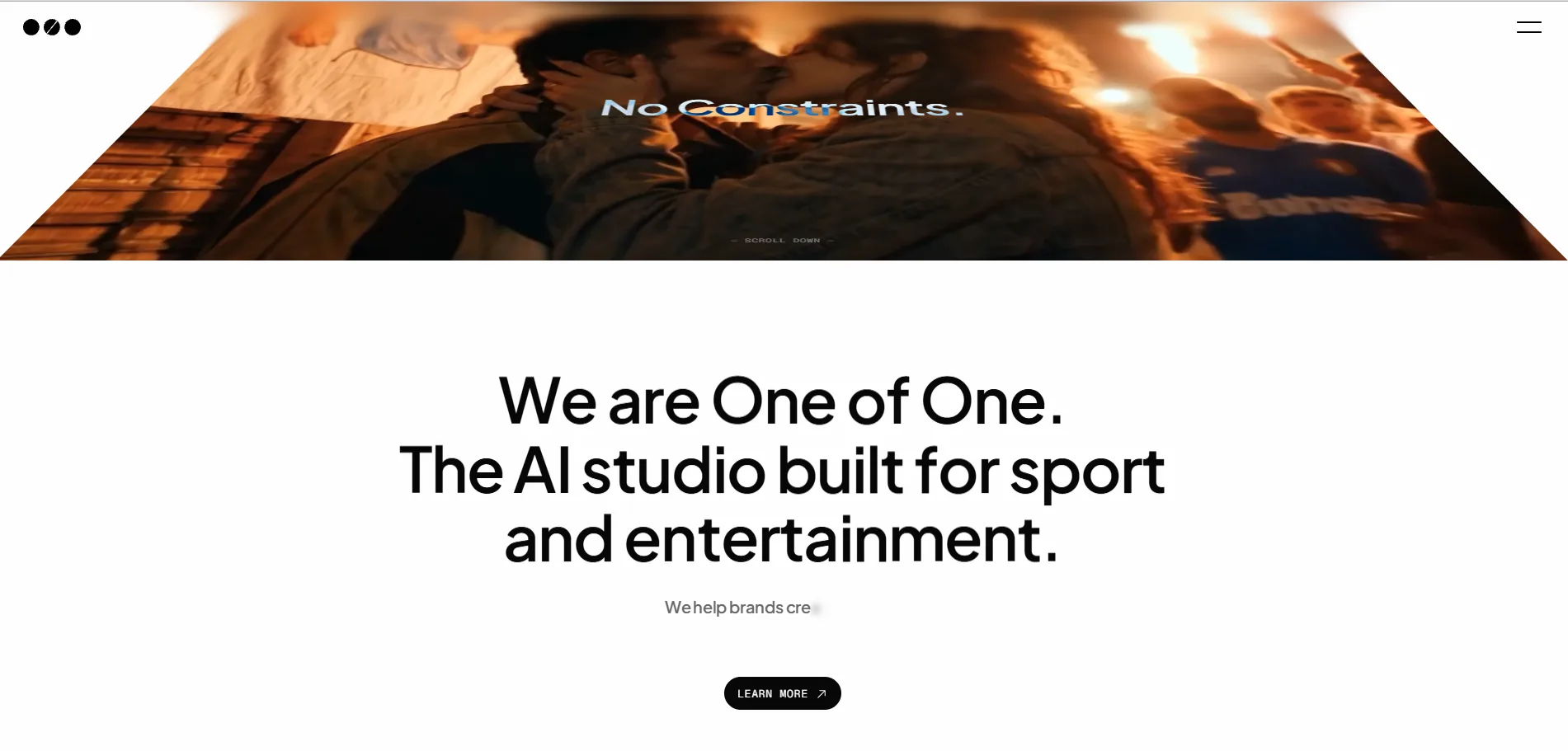
11. One of One
Best AI Product Marketing
Website: https://one-of-one-ai.com/
Category: AI
Why It Stands Out
Launching an AI product comes with a unique challenge.
The market is saturated with similar messaging, futuristic visuals, and bold promises. As a result, many AI websites end up feeling interchangeable, relying on familiar gradients, abstract graphics, and generic claims about transforming the future.
One of One avoids that trap.
Instead of trying to impress visitors with complexity, the website focuses on communicating a distinctive product identity. Every section reinforces the same core message, creating a clear narrative that feels intentional from beginning to end.
One of the strongest aspects of the design is its confidence.
Rather than overwhelming users with endless features, technical terminology, or exaggerated marketing language, the website carefully controls the amount of information revealed at each stage. Every new section builds on what came before, allowing visitors to develop a clear understanding of the product without feeling overloaded.
The visual design follows the same philosophy.
Motion is subtle, layouts remain spacious, and the interface never competes with the content. Product visuals are given room to breathe, while typography and spacing create a calm reading experience that feels both modern and credible.
Another detail worth studying is how branding remains consistent across the entire journey.
Nothing feels disconnected or experimental for the sake of being different. Every interaction supports the same visual language, reinforcing the product's personality without distracting from its value proposition.
In a category where many websites try to say everything at once, One of One demonstrates that clarity and confidence often leave a much stronger impression than visual spectacle.
What Designers Can Learn
Build your product narrative around a single, memorable message.
Introduce features progressively instead of listing everything at once.
Let branding create differentiation before relying on visual effects.
Use simplicity to communicate confidence.
Steal This Idea 💡
If your homepage contains five different messages, visitors will probably remember none of them.
Choose one central idea and make every section reinforce it.
The strongest product websites don't introduce a new story with every scroll—they tell the same story from different angles until the value proposition becomes unmistakably clear.
12. Laundry Loft
Best Brand Personality
Website: https://www.laundryloftnyc.com/
Category: Local Business
Why It Stands Out
Building a memorable brand isn't reserved for startups with million-dollar budgets or global technology companies.
Laundry Loft proves that even a local service business can create a digital experience that's distinctive, engaging, and instantly recognisable.
From the very first interaction, the website communicates personality.
Rather than relying on the generic design patterns often associated with local business websites, it embraces a confident visual identity that feels both modern and approachable. Every colour choice, image, interaction, and piece of copy contributes to a cohesive brand experience that visitors are likely to remember long after leaving the site.
One of the website's greatest strengths is consistency.
Nothing feels generic or interchangeable. The tone of voice, photography, typography, and motion all reinforce the same personality, creating an experience that feels authentic rather than manufactured.
Another aspect worth studying is how branding supports usability.
Despite having a playful identity, the website never sacrifices clarity. Important information remains easy to find, calls to action are clearly prioritised, and navigation stays intuitive throughout the experience.
This balance is surprisingly difficult to achieve.
Many highly branded websites become harder to use because visual expression takes priority over usability. Laundry Loft demonstrates that both can coexist when branding is treated as part of the user experience rather than an extra design layer.
Ultimately, the website reminds us that strong branding isn't about looking different for the sake of it.
It's about creating an experience that feels unmistakably yours.
What Designers Can Learn
Treat branding as part of the user experience, not just the visual design.
Build consistency across typography, imagery, colour, motion, and tone of voice.
Create memorable experiences without compromising usability.
Strong personality often comes from consistency rather than complexity.
Steal This Idea 💡
Ask yourself a simple question:
If I removed the logo from this website, would people still recognise the brand?
If the answer is no, your branding probably relies too heavily on visual identity alone.
The strongest websites communicate personality through every design decision—from layout and typography to imagery, motion, and copywriting.
13. Heat Bureau
Best Premium Branding
Website: https://heatbureau.com/
Category: Creative Agency
Why It Stands Out
Creating a premium digital experience isn't about adding more visual effects.
In fact, the opposite is often true.
Heat Bureau demonstrates how careful restraint can create a stronger sense of quality than an interface filled with animations, gradients, and decorative elements.
The website immediately feels intentional.
Typography is confident without becoming overpowering, layouts are spacious without feeling empty, and every interaction appears measured rather than attention-seeking. Nothing feels rushed, and every design decision contributes to the same perception: this is a studio that values craftsmanship.
One of the strongest aspects of the experience is pacing.
Sections unfold naturally, giving visitors enough time to absorb information before introducing something new. Instead of trying to impress through constant visual stimulation, the website creates confidence through clarity and rhythm.
Material choices also deserve attention.
Photography, colour, typography, and motion all work together to reinforce the same premium aesthetic. No single element dominates the experience. Instead, they combine to create an atmosphere that feels refined and cohesive from beginning to end.
Perhaps the biggest lesson is understanding that luxury is rarely created by complexity.
It's created by precision.
Every element feels carefully placed, every interaction has a purpose, and every page reinforces the same level of quality.
That's exactly what makes the website memorable.
What Designers Can Learn
Premium design comes from precision, not decoration.
Create rhythm by controlling pacing instead of relying on constant animation.
Let every visual element contribute to the same brand perception.
Remove anything that doesn't strengthen the overall experience.
Steal This Idea 💡
When reviewing your next project, don't ask yourself:
"What else can I add?"
Instead ask:
"What can I remove without making the experience worse?"
Premium websites often feel luxurious because every unnecessary element has already been eliminated.
Design isn't just about what remains.
It's also about what you deliberately choose to leave out.
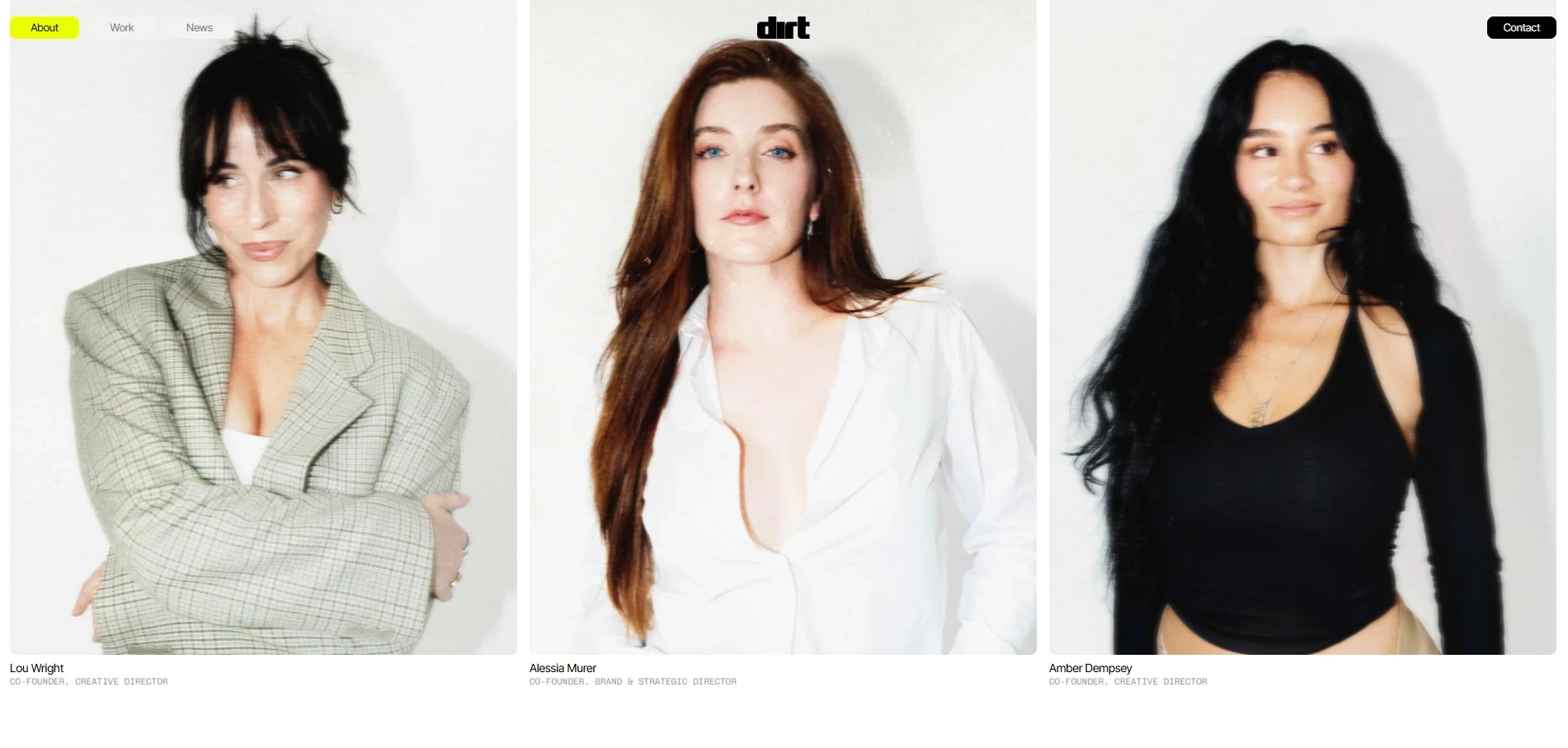
14. Dirtverse
Best Creative Direction
Website: https://dirtverse.co/
Category: Creative Experience
Why It Stands Out
Most websites are designed to feel familiar.
Dirtverse deliberately challenges that expectation.
Rather than following conventional layouts or predictable user flows, the website embraces experimentation as part of its identity. Every interaction, transition, and visual composition feels carefully crafted to create curiosity, encouraging visitors to explore rather than simply consume information.
What's particularly impressive is that this experimentation never feels random.
Despite its unconventional approach, the website maintains a clear creative vision. Typography, imagery, motion, and layout all support the same artistic direction, creating an experience that feels cohesive rather than chaotic.
This balance is incredibly difficult to achieve.
Many experimental websites become frustrating because originality comes at the expense of usability. Dirtverse manages to push creative boundaries while still giving visitors enough structure to understand where they are and what they should do next.
The website also demonstrates a strong understanding of pacing.
Instead of revealing everything immediately, it rewards exploration. As users scroll and interact with the interface, new visual moments unfold naturally, making the experience feel less like browsing a website and more like discovering a digital exhibition.
Perhaps the biggest lesson is knowing when to break established design conventions.
Creative direction isn't about ignoring best practices.
It's about understanding them well enough to challenge them intentionally.
What Designers Can Learn
Experiment with purpose rather than novelty.
Build a strong creative concept before designing individual sections.
Create memorable moments without sacrificing usability.
Use interaction design to reinforce your brand's personality.
Steal This Idea 💡
Before introducing an unconventional interaction, ask yourself one question:
"Does this help express the brand, or is it simply trying to surprise people?"
The most memorable creative websites don't use unusual interactions because they're different.
They use them because they're the most effective way to communicate the brand's identity.
When creativity supports the story, visitors remember the experience.
When it competes with the story, they only remember the effect.
15. Paysages Studio
Best Editorial Composition
Website: https://paysages.studio/
Category: Design Studio
Why It Stands Out
One of the most overlooked skills in web design is composition.
Designers often focus on individual elements—buttons, typography, colours, animations—but great websites are rarely defined by those components alone. They're defined by how everything works together.
Paysages Studio is an excellent example of this principle.
Rather than relying on dramatic interactions or highly experimental layouts, the website creates impact through balance, rhythm, and thoughtful composition. Every section feels carefully arranged, allowing typography, imagery, and whitespace to work together without competing for attention.
One of the first things you'll notice is the pacing.
Large visual moments are followed by quieter sections, dense content is balanced with generous whitespace, and typography scales naturally throughout the page. This variation creates a comfortable reading rhythm that encourages visitors to continue exploring.
Another strength is the relationship between content and imagery.
Images never feel like decorative fillers. Instead, they become structural elements within the composition, helping establish hierarchy and reinforcing the editorial feel of the website. Every visual decision appears intentional, creating an experience that feels curated rather than assembled.
The restrained use of colour also deserves recognition.
Instead of relying on bold palettes to attract attention, the website allows layout, proportion, and spacing to become the primary design tools. This gives the entire experience a timeless quality that feels sophisticated without appearing overly minimal.
Ultimately, Paysages Studio reminds us that outstanding web design isn't always about introducing something new.
Sometimes, it's about arranging familiar elements with exceptional care.
What Designers Can Learn
Think about the relationship between sections, not just individual components.
Use whitespace to establish rhythm across the entire page.
Treat imagery as part of the layout instead of decorative content.
Create visual variety through composition rather than constant stylistic changes.
Steal This Idea 💡
Zoom out.
Literally.
Reduce your browser window to around 25% or take a screenshot of your homepage and view it as a thumbnail.
Can you still recognise a clear visual rhythm?
Do sections feel balanced?
Is there enough variation between dense and open areas?
Great composition works at every scale—not just when you're focused on individual details.
Final Thoughts
After studying these 15 websites, one thing becomes clear:
Outstanding web design isn't defined by a particular style.
Some of the websites in this collection are bold and expressive. Others are restrained and minimal. Some rely heavily on motion, while others let typography and layout do most of the work.
What they all have in common is intention.
Every interaction, layout decision, animation, and visual choice serves a purpose. Nothing feels arbitrary or added simply because it's fashionable.
That's perhaps the most valuable lesson any designer can take away.
Inspiration isn't about copying what others have built.
It's about understanding why their decisions work—and applying those principles to your own projects in a way that feels authentic.
Study these websites carefully.
Analyse their structure, question their design choices, and identify the patterns that appear again and again.
Because the best designers don't collect inspiration.
They learn how to recognise great design.

Try Systeme.io
Your website is only the beginning.
Take your Framer site further with funnels, email marketing, automation, bookings and more.


AFFILIATE PARTNER